

Fans don't justfollow teams
They followthe scene.
Project B is a point of view, not a place –
and never business as usual. A league
that refuses to be limited by borders, genders or access rights. We give fans
a sport with genuine perspective,
not an empty vessel.
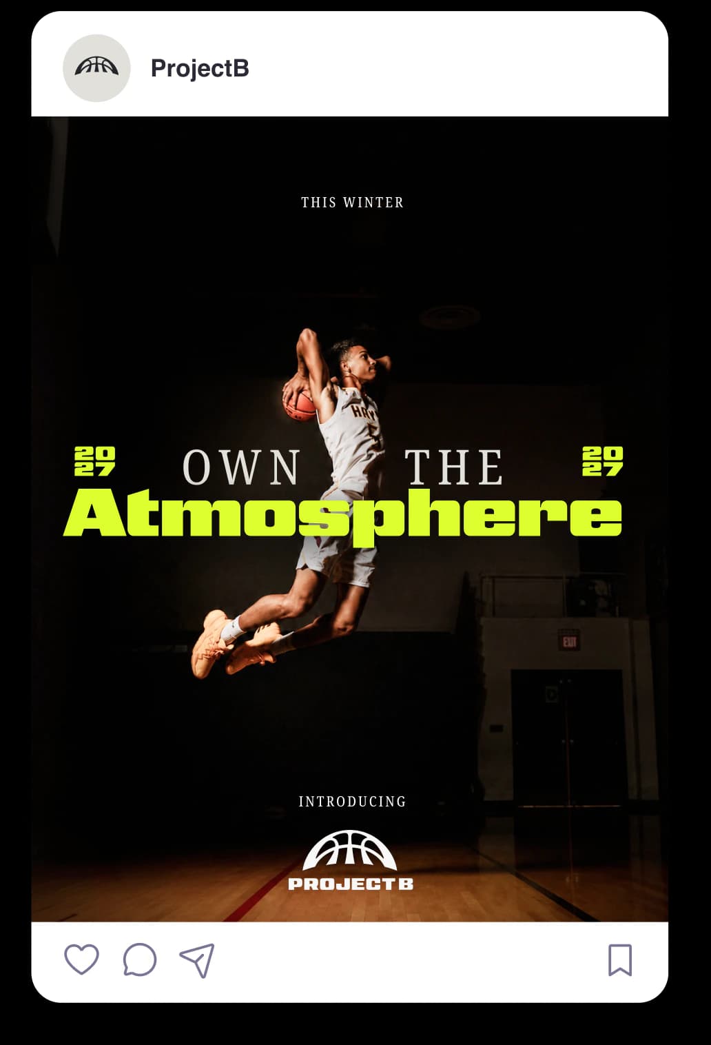
Together we shaped that point of view around three things: elite confidence, uncompromising integrity, and a game rewritten for the world.
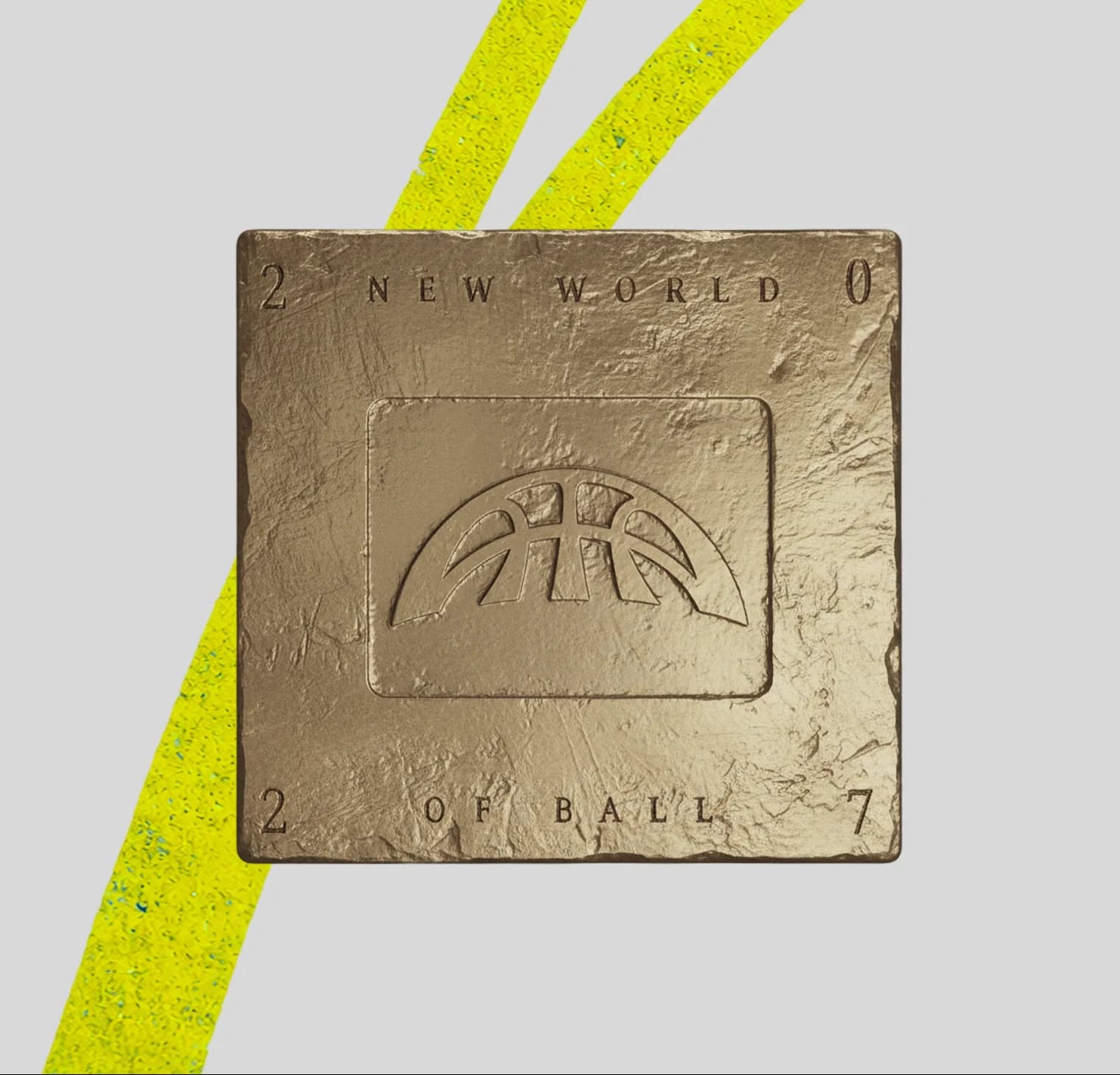
Project B. The new world of ball.

Building a global basketball brand for a new women’s and men’s professional league.
Basketball
is rising
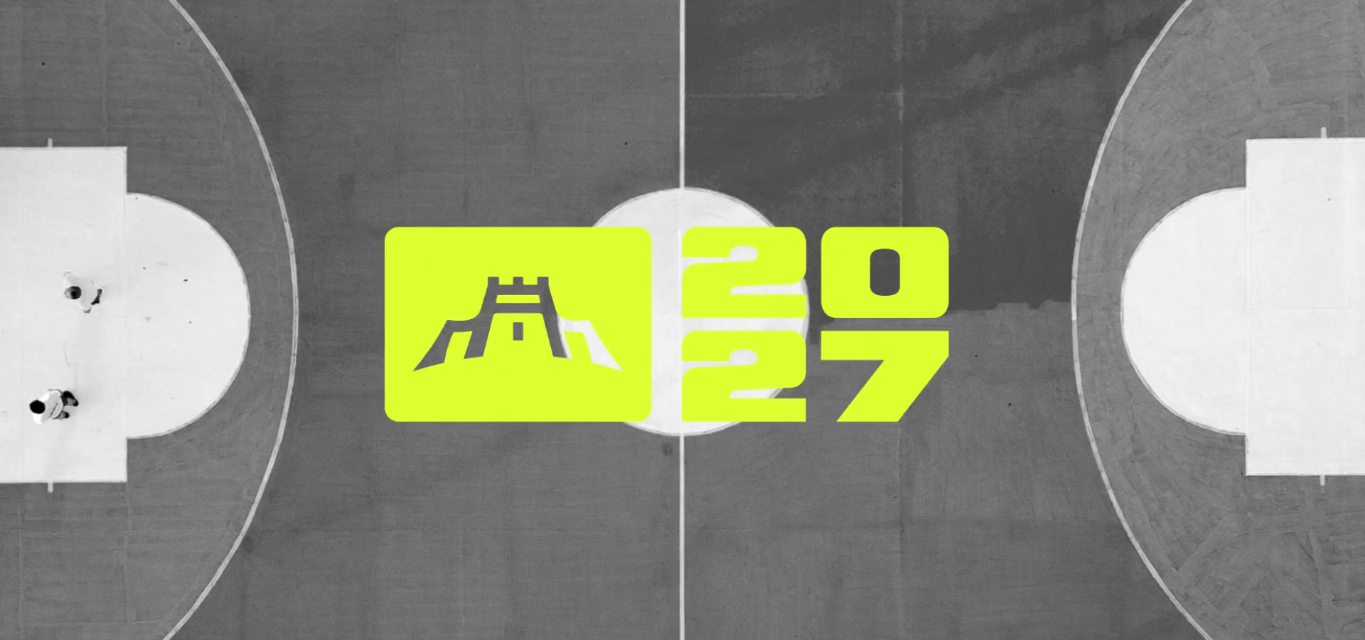
The new world of ball
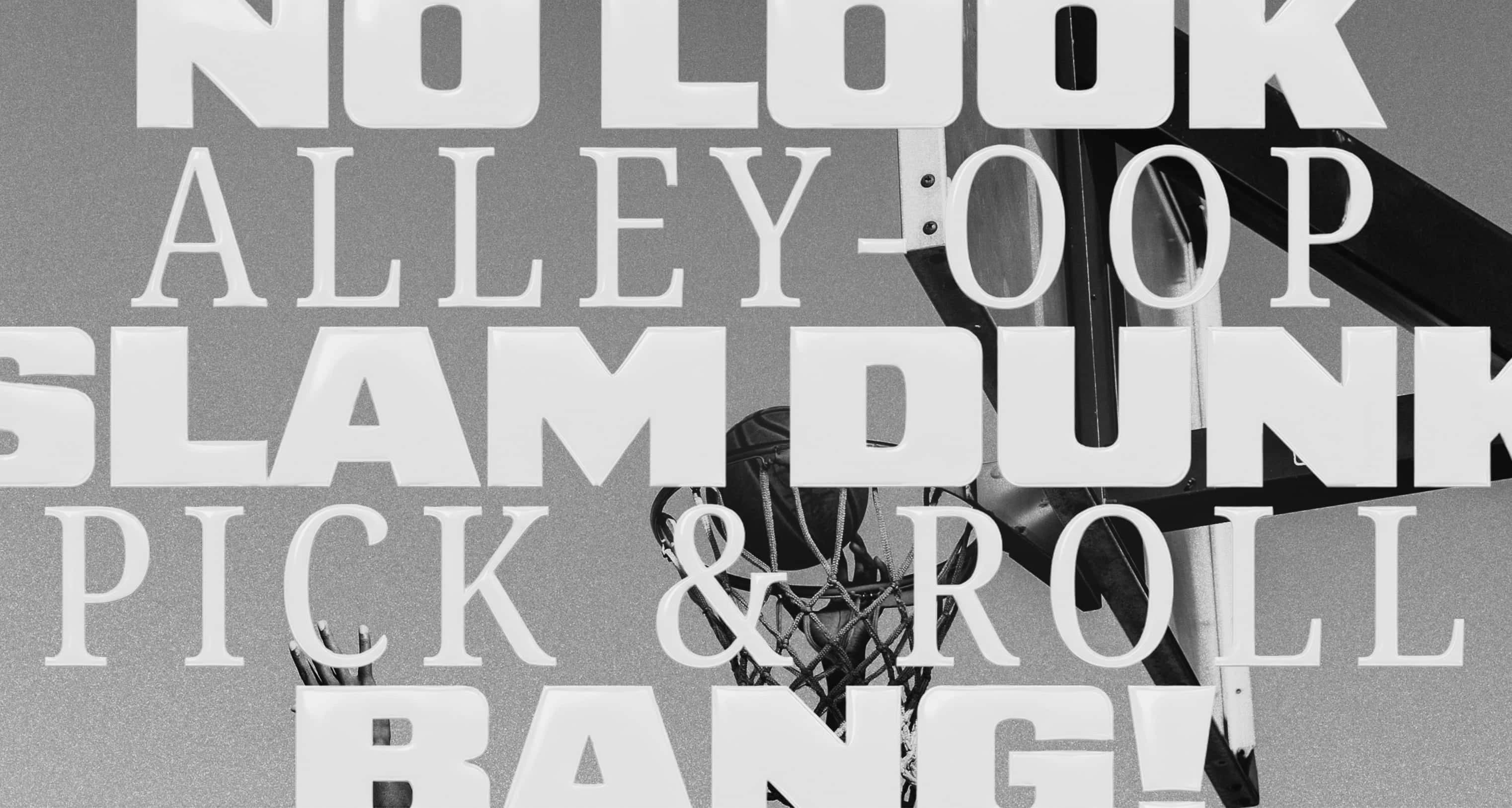
The court created the culture,
the world made it their own.


Basketball atthe highest level.
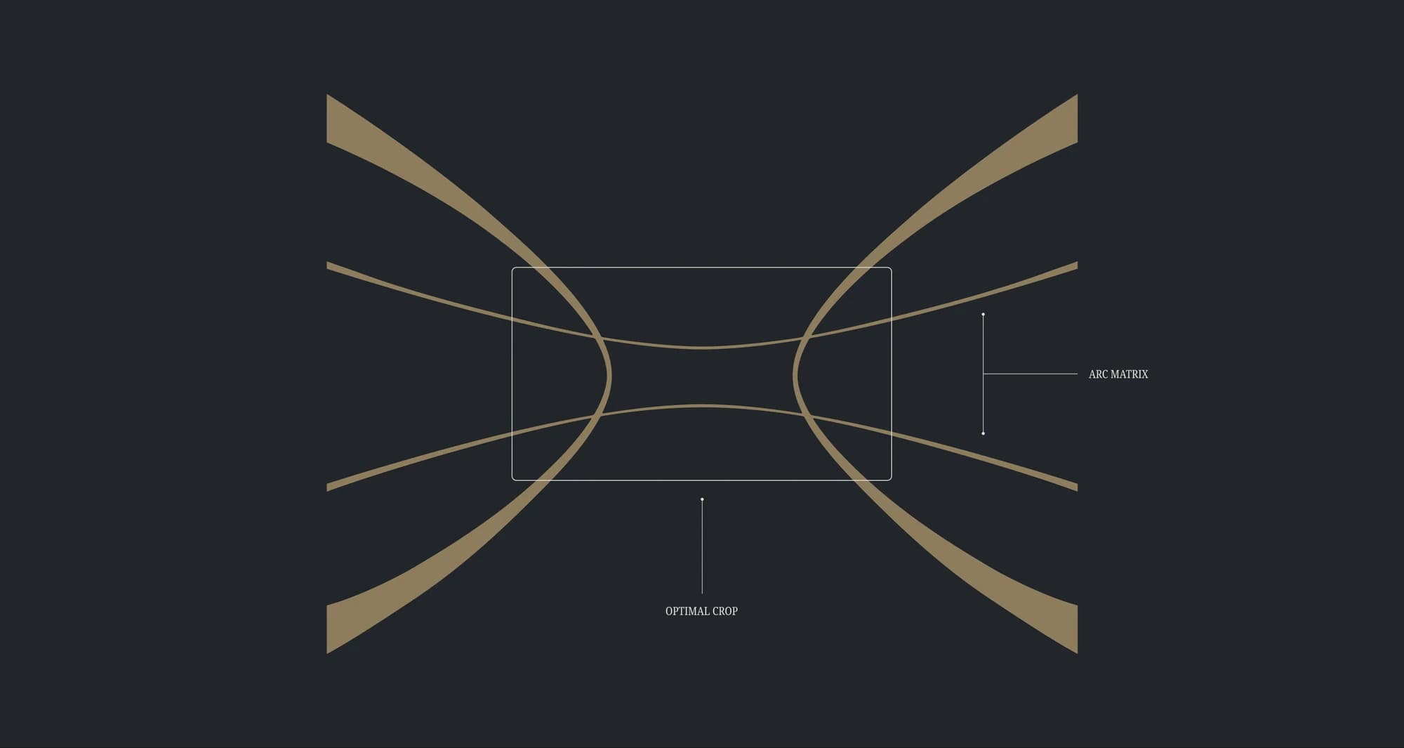
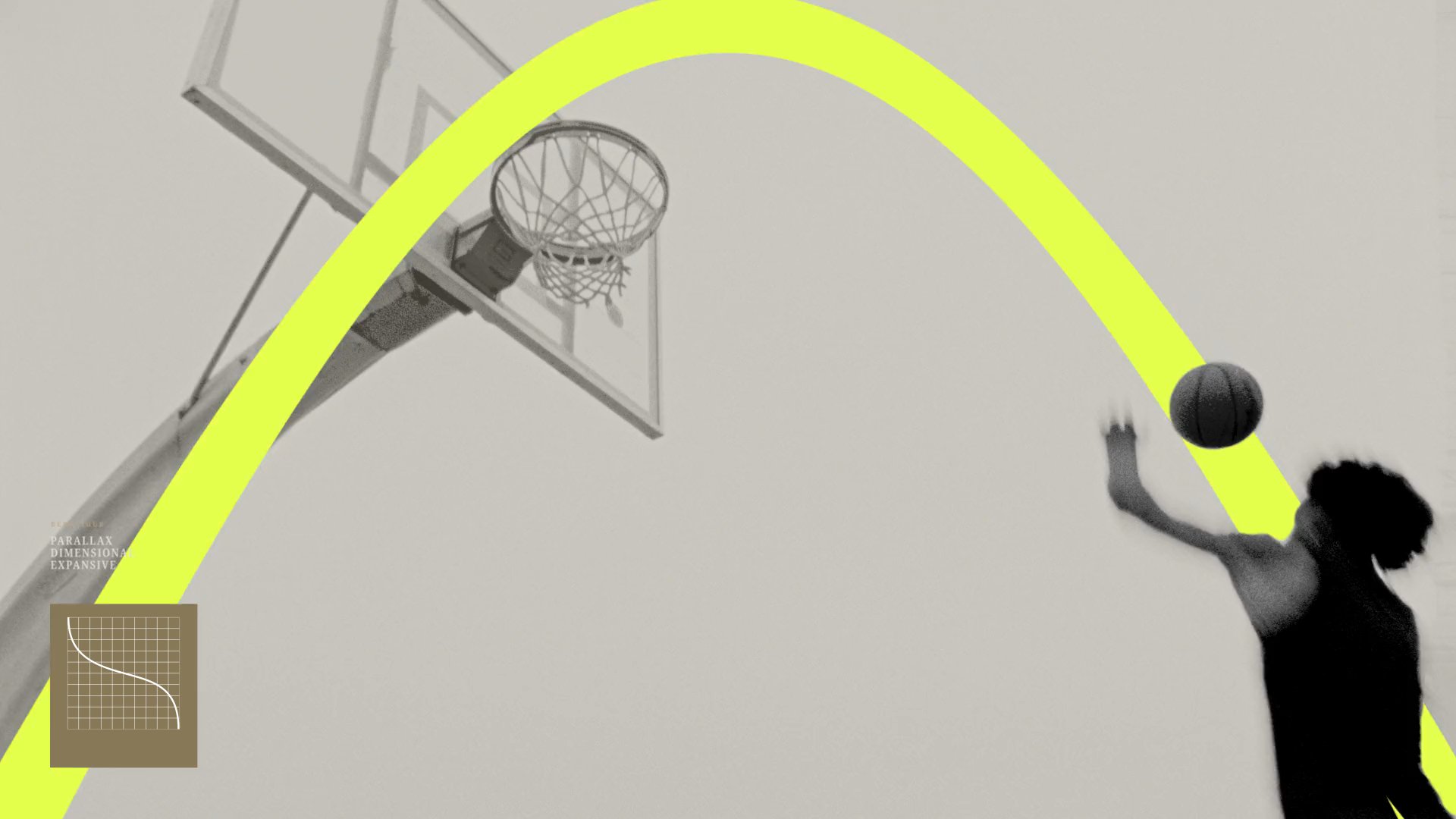
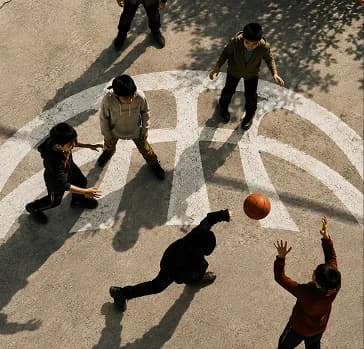
Every shothas an arc,
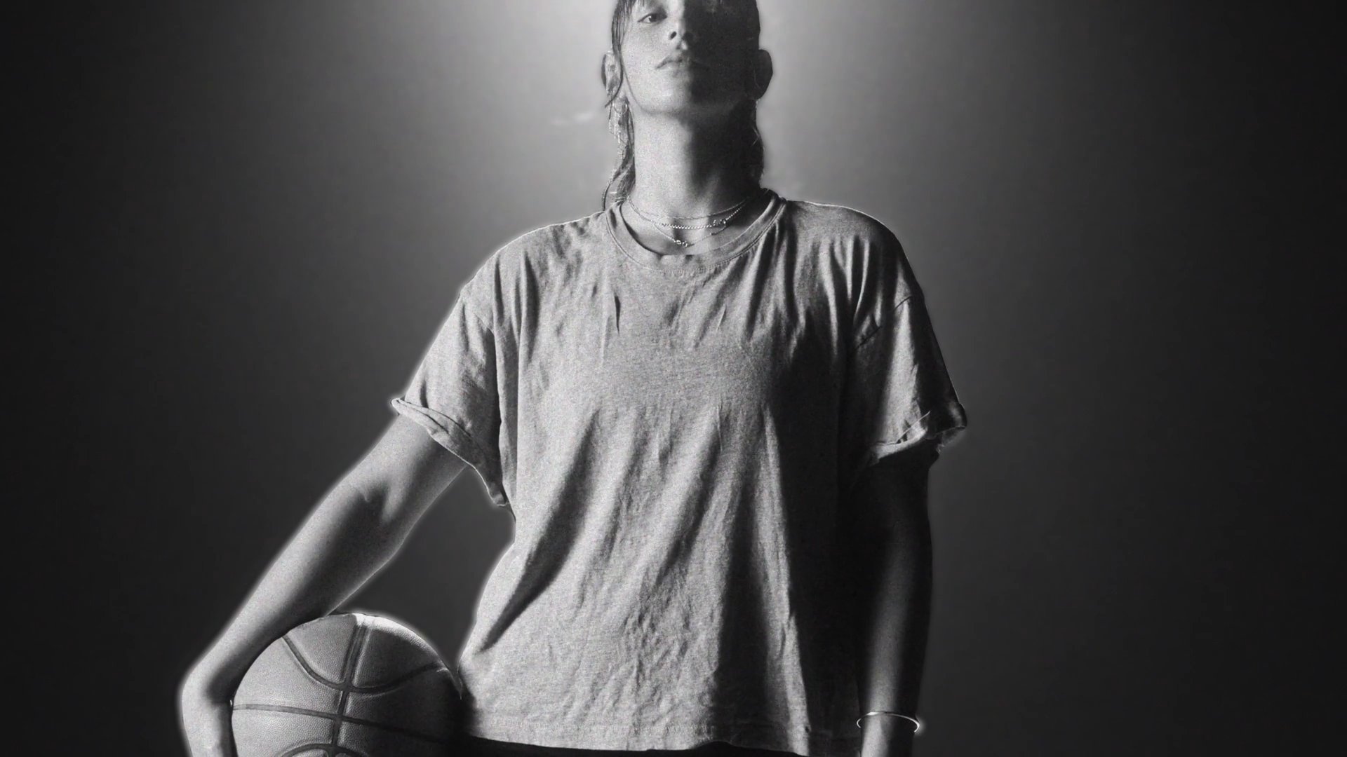
And so doesevery story.



MAKINGTHEACTION
The next arc
CLOSER.THANEVER.
BALLBEYONDFIXEDBORDERS,
Project B
TOWARDSA BIGGER,MOREEXCITING
FUTURE.
Owned by athletes,
backed by legends of the game.
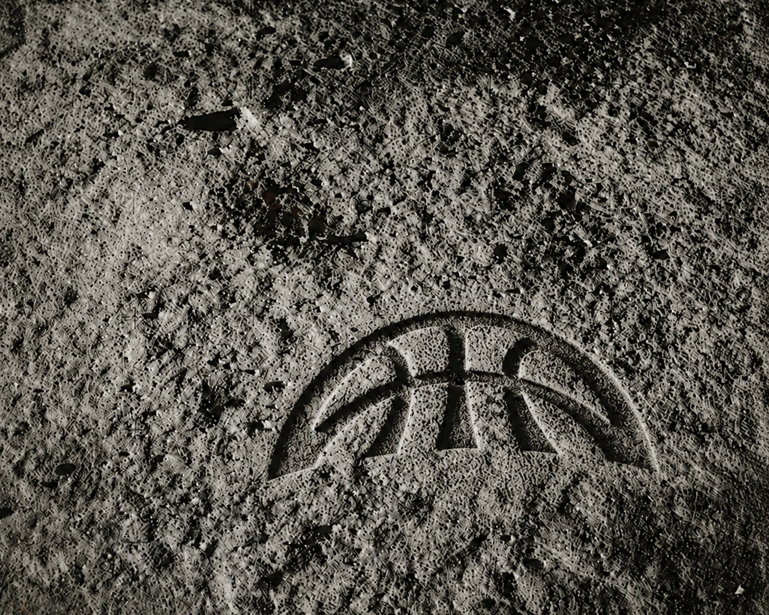
City
  to city.

          Court
          to court.

  Person to
          person.
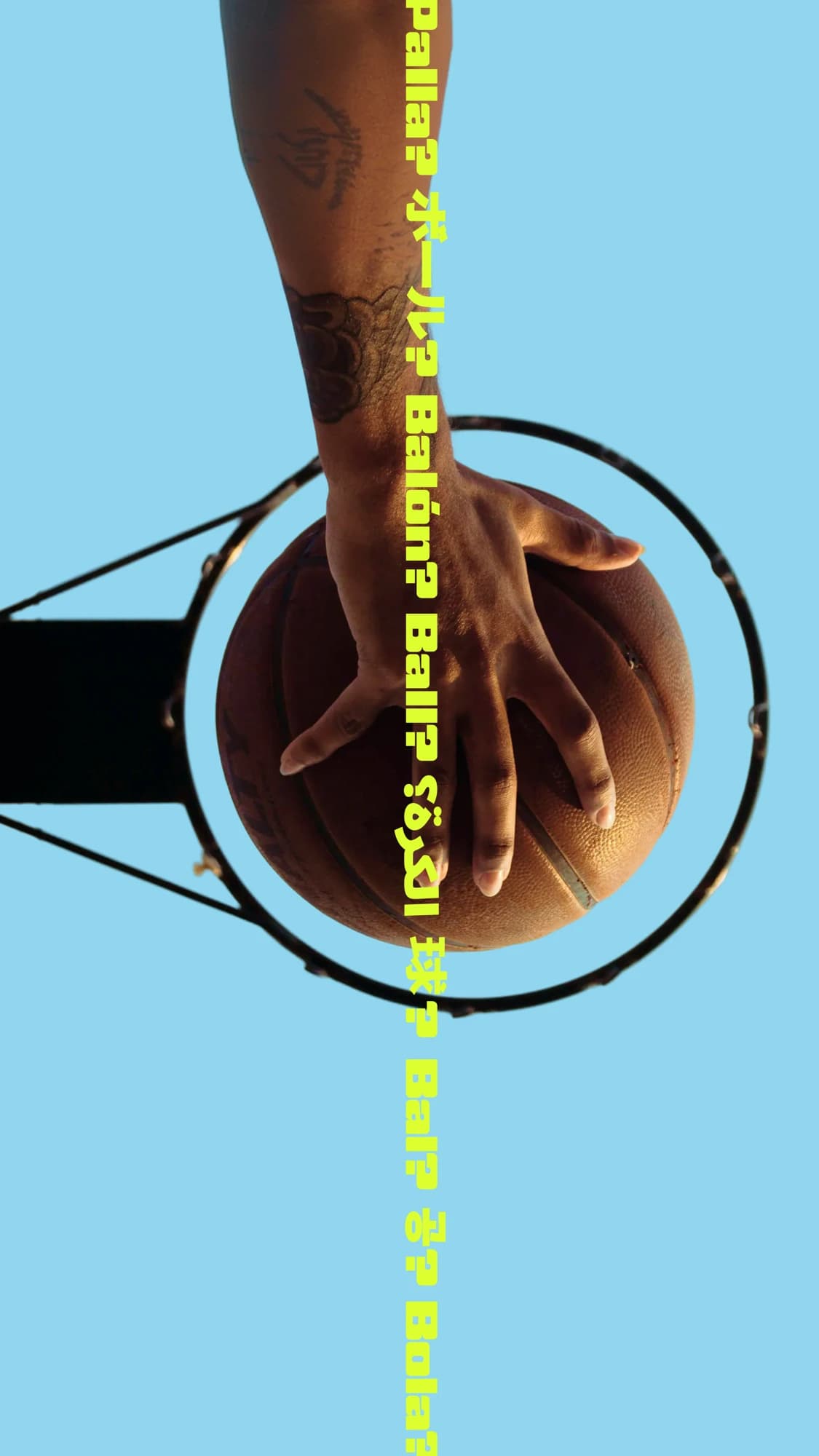
Bringing ball
to the world
The world of ball.

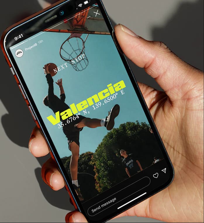
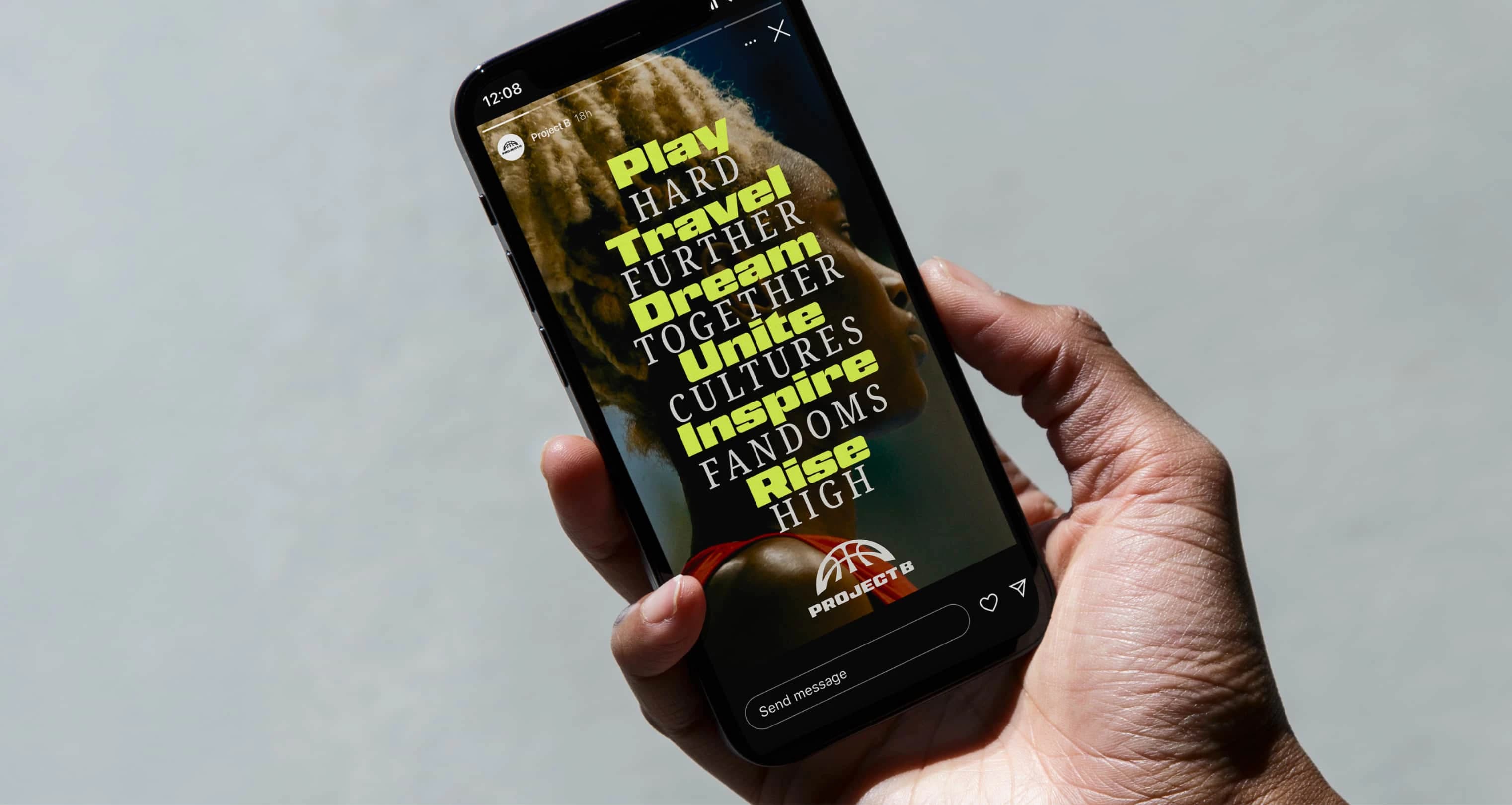
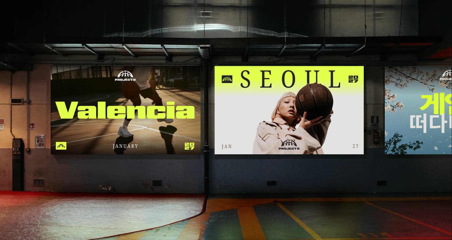
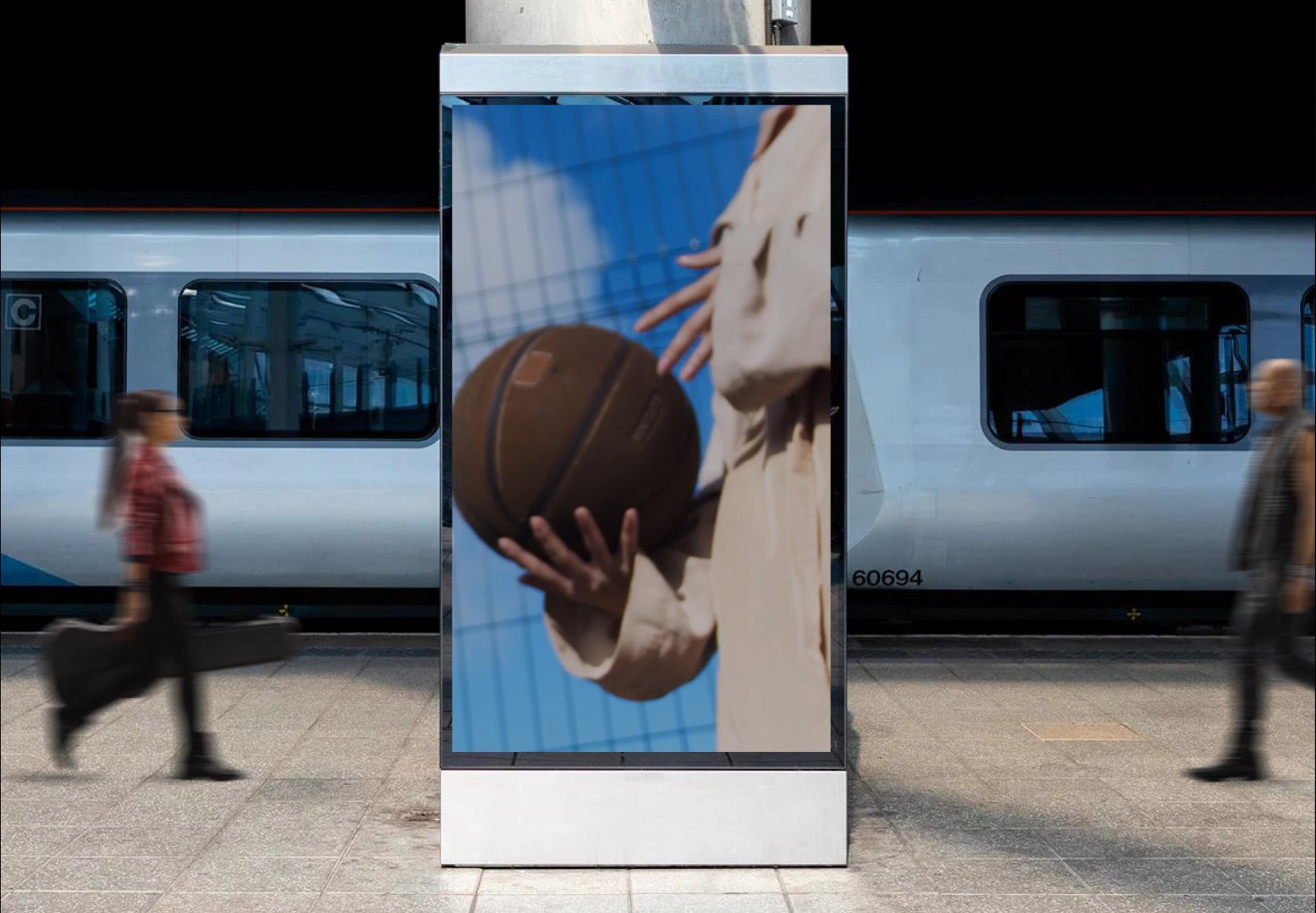
Connecting cities, cultures, and communities
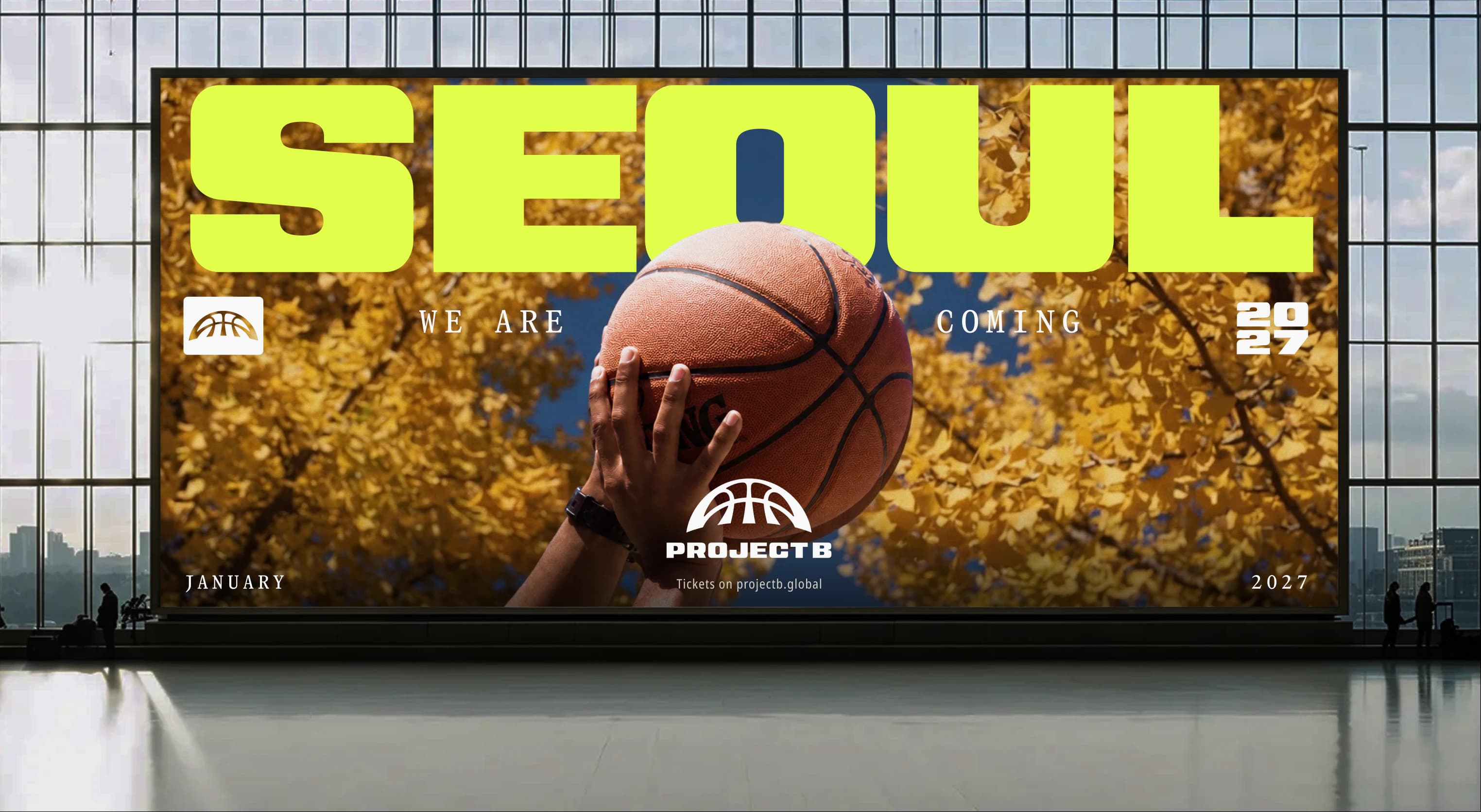
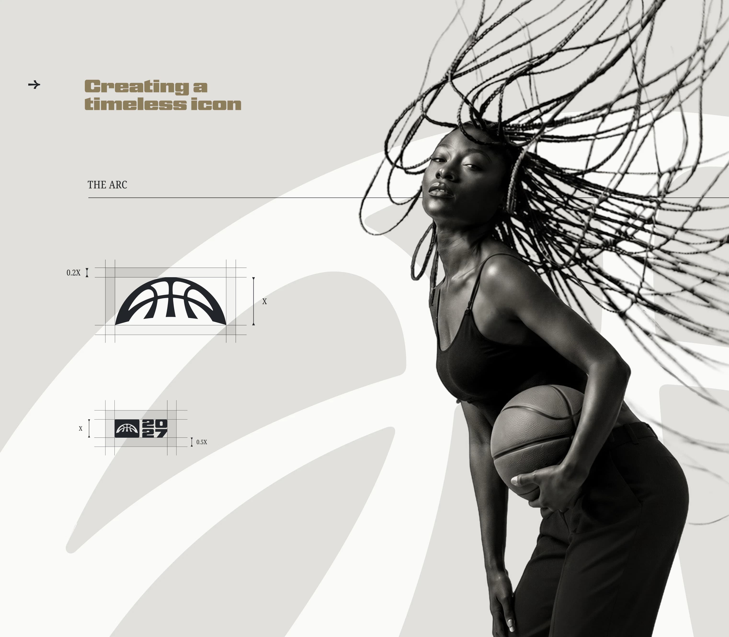
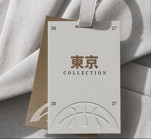
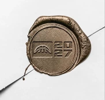
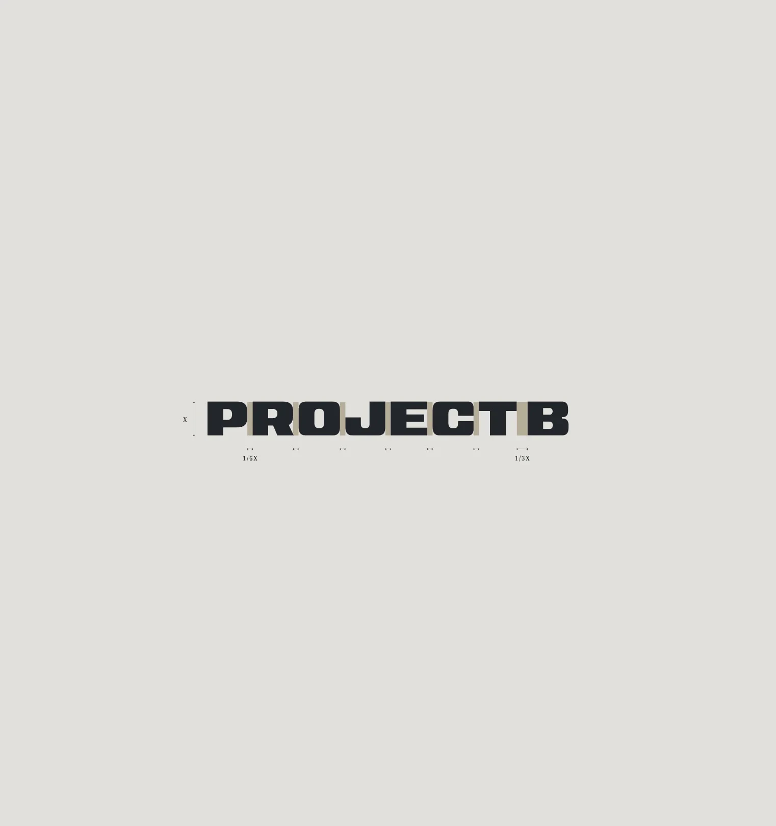

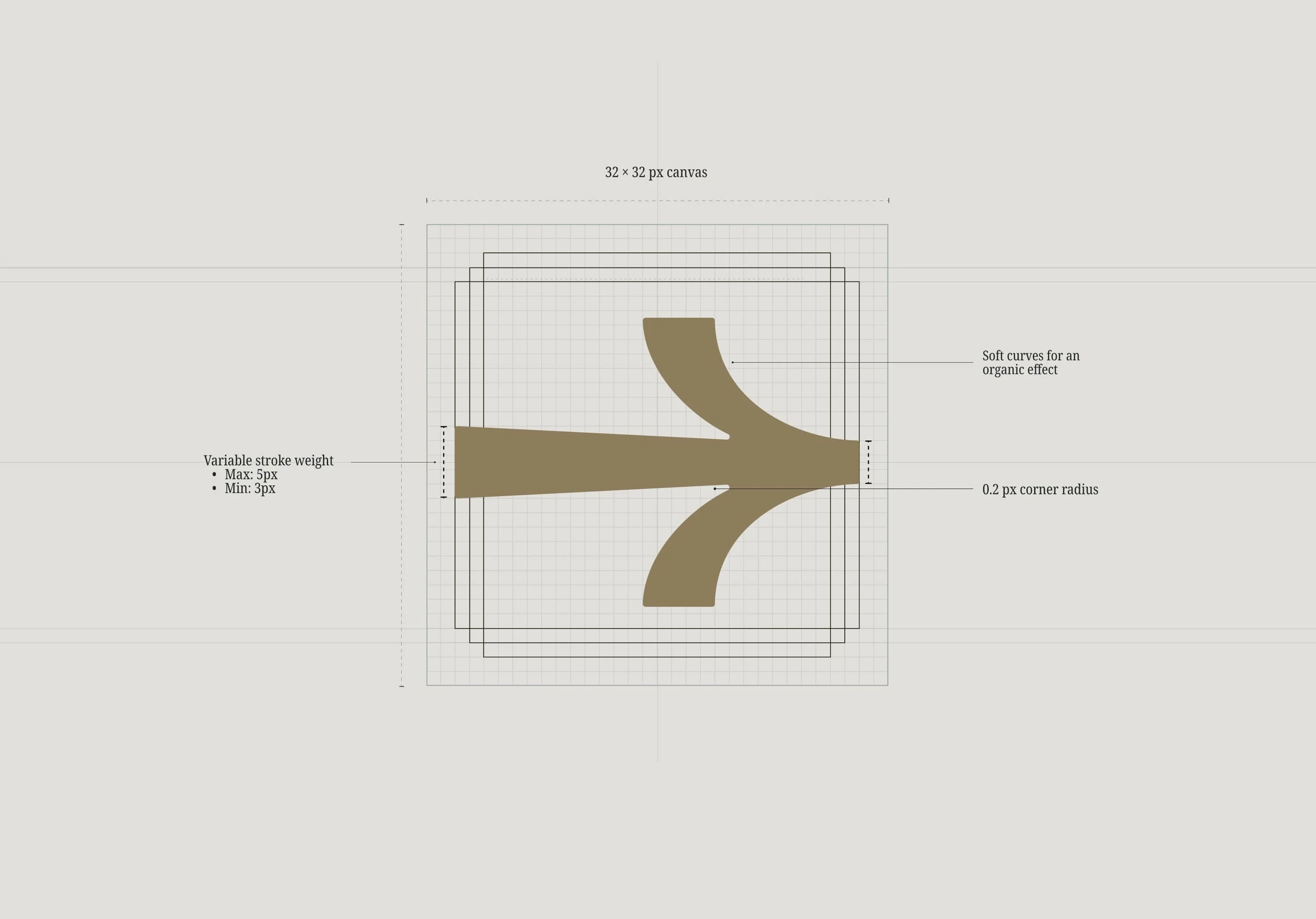
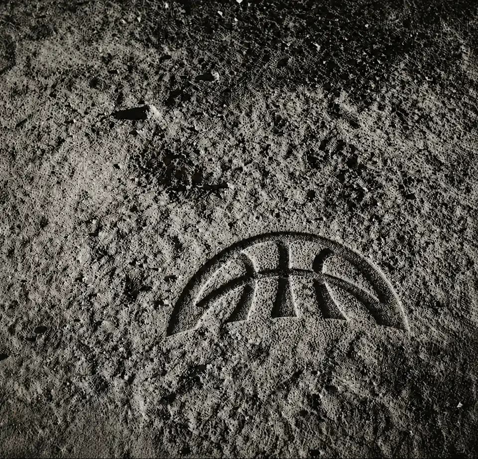
Wordmark
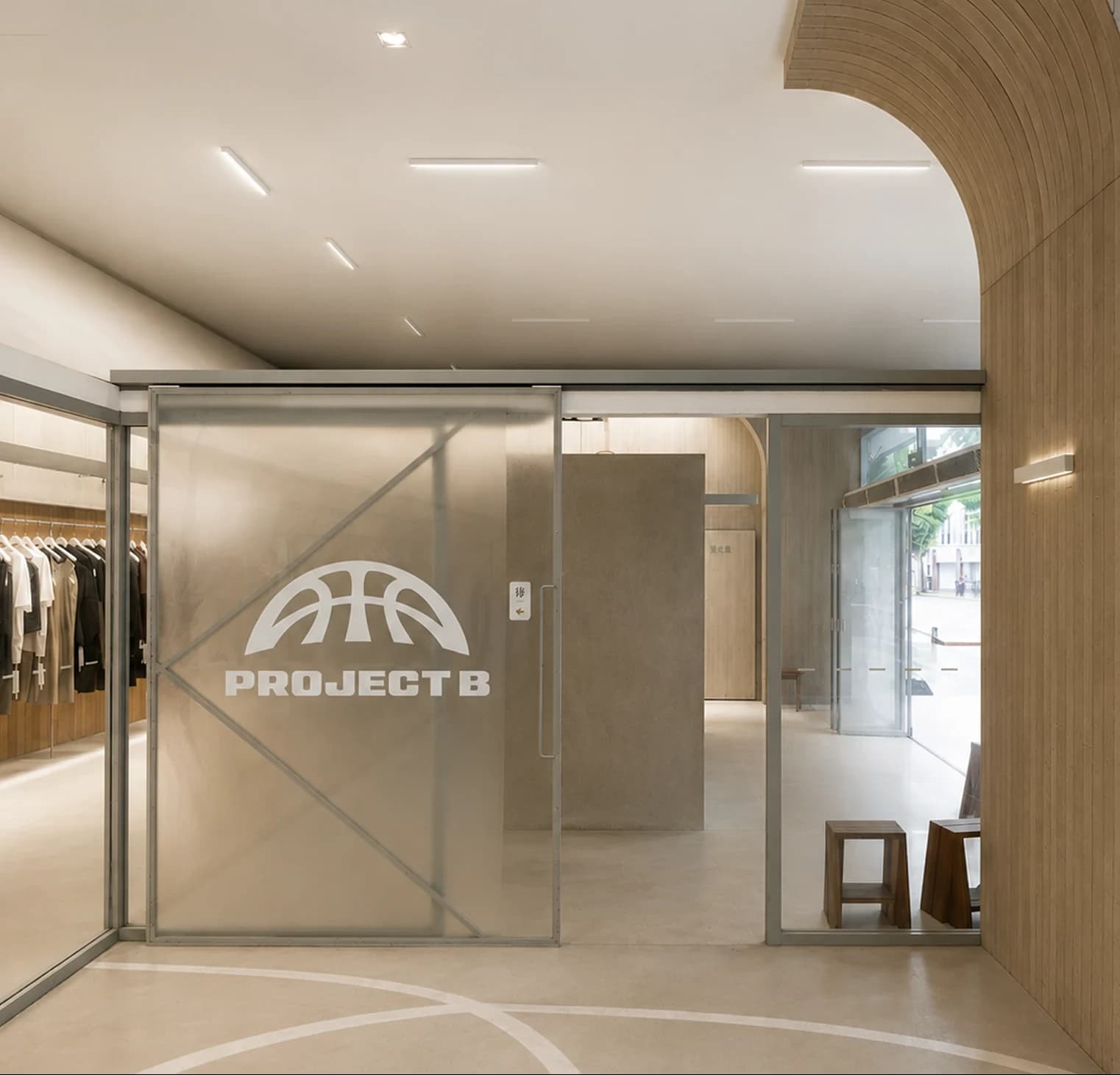
The Project B wordmark is designed to express the league's core attributes: strength, confidence, and competitive energy. Its bold, geometric construction creates an unmistakable visual presence that performs equally well across digital, broadcast, merchandise, and live event environments.
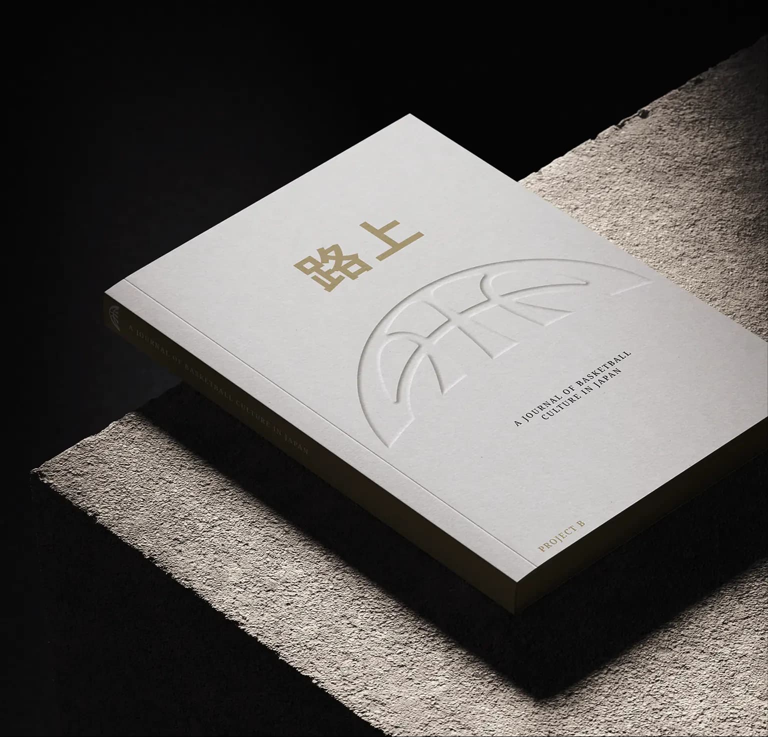
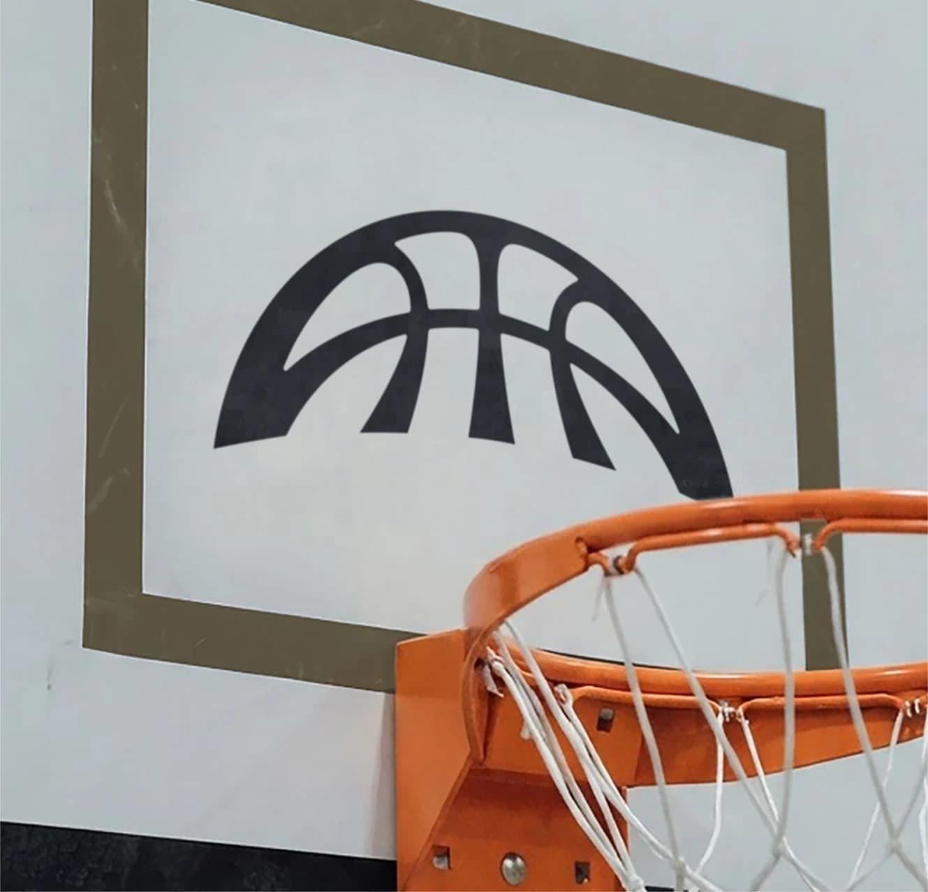
Logo suiteProject B brand bookLogo suite001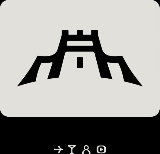
Built with the rhythm of the court and the energy of the fans.
Elite integrity
A premium league built on sporting excellence, not spectacle. Every detail reflects the credibility, ambition and integrity of world-class basketball.
Platform flexibility
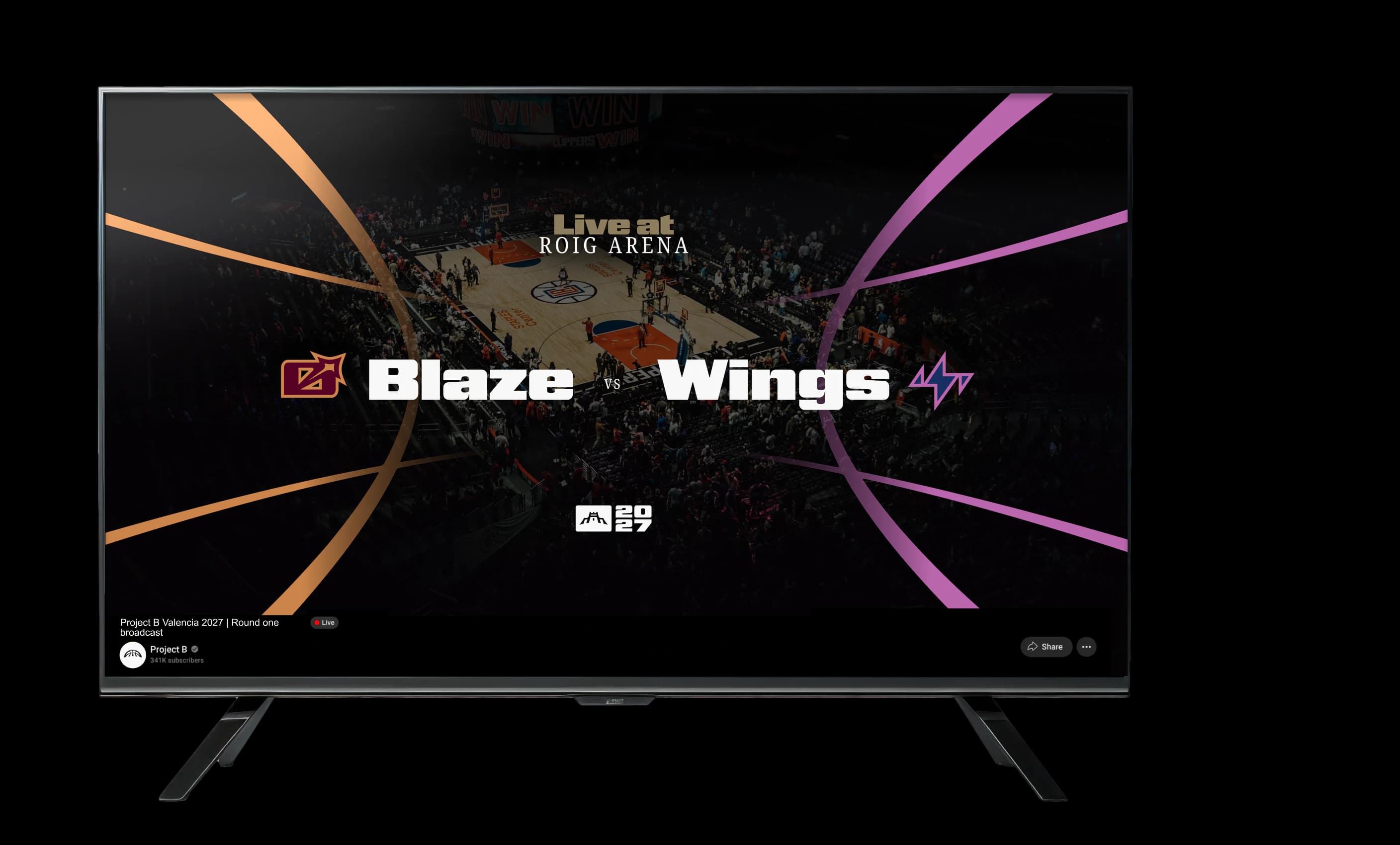
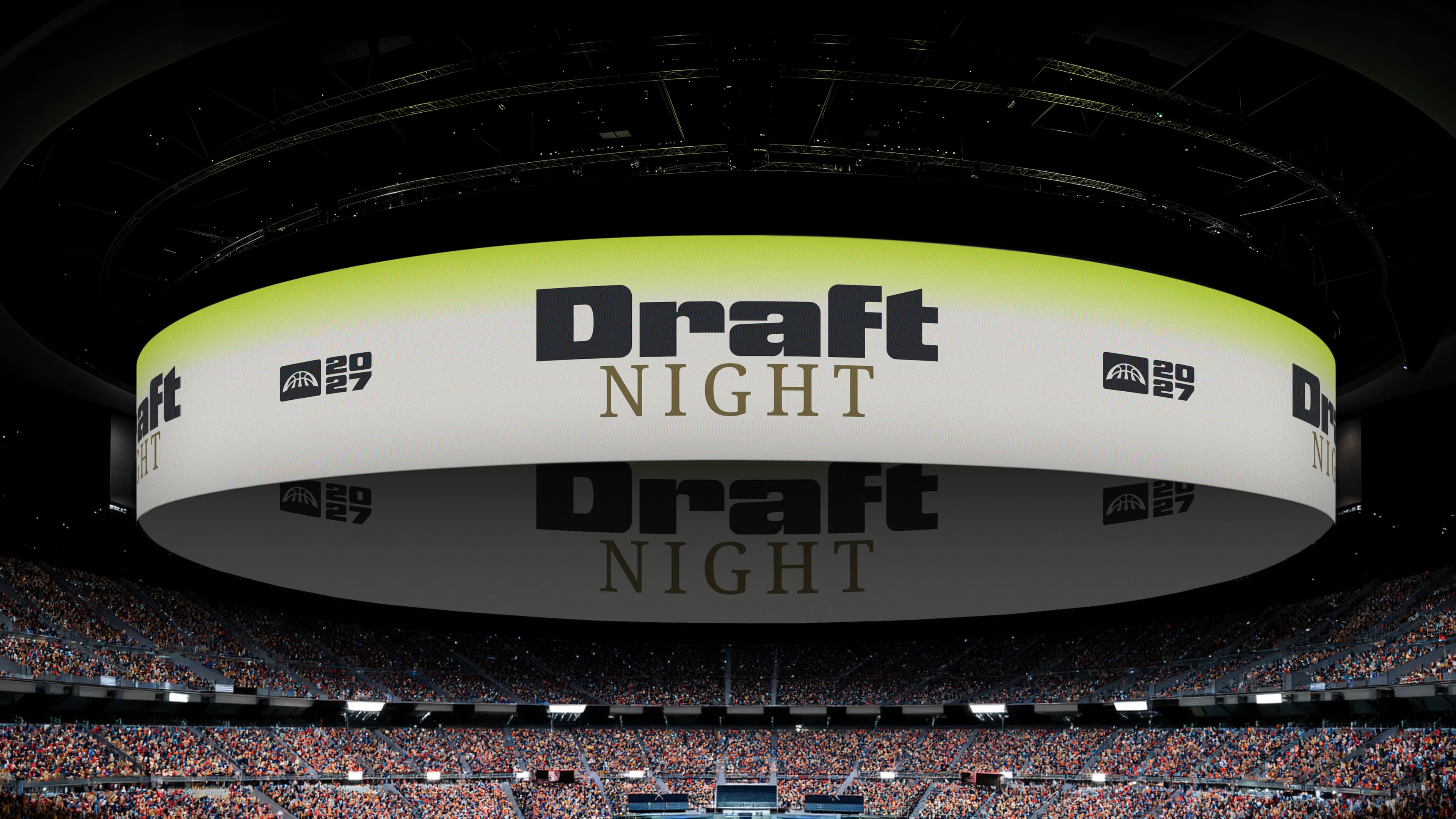
A scalable, flexible identity designed to perform seamlessly across every touchpoint, from broadcast and social to live arenas and future experiences.
Global relevance
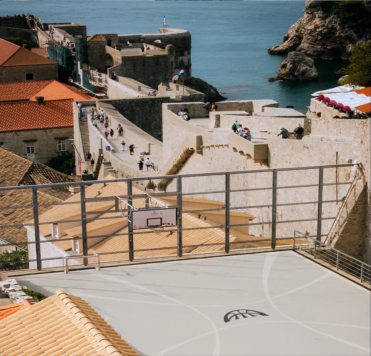
A touring league that meets fans where they are, connecting cities, cultures and communities while driving a continuous global conversation.
Palpable energy
From the arena to the broadcast, every moment captures the intensity, emotion and electricity of basketball played at its highest level.
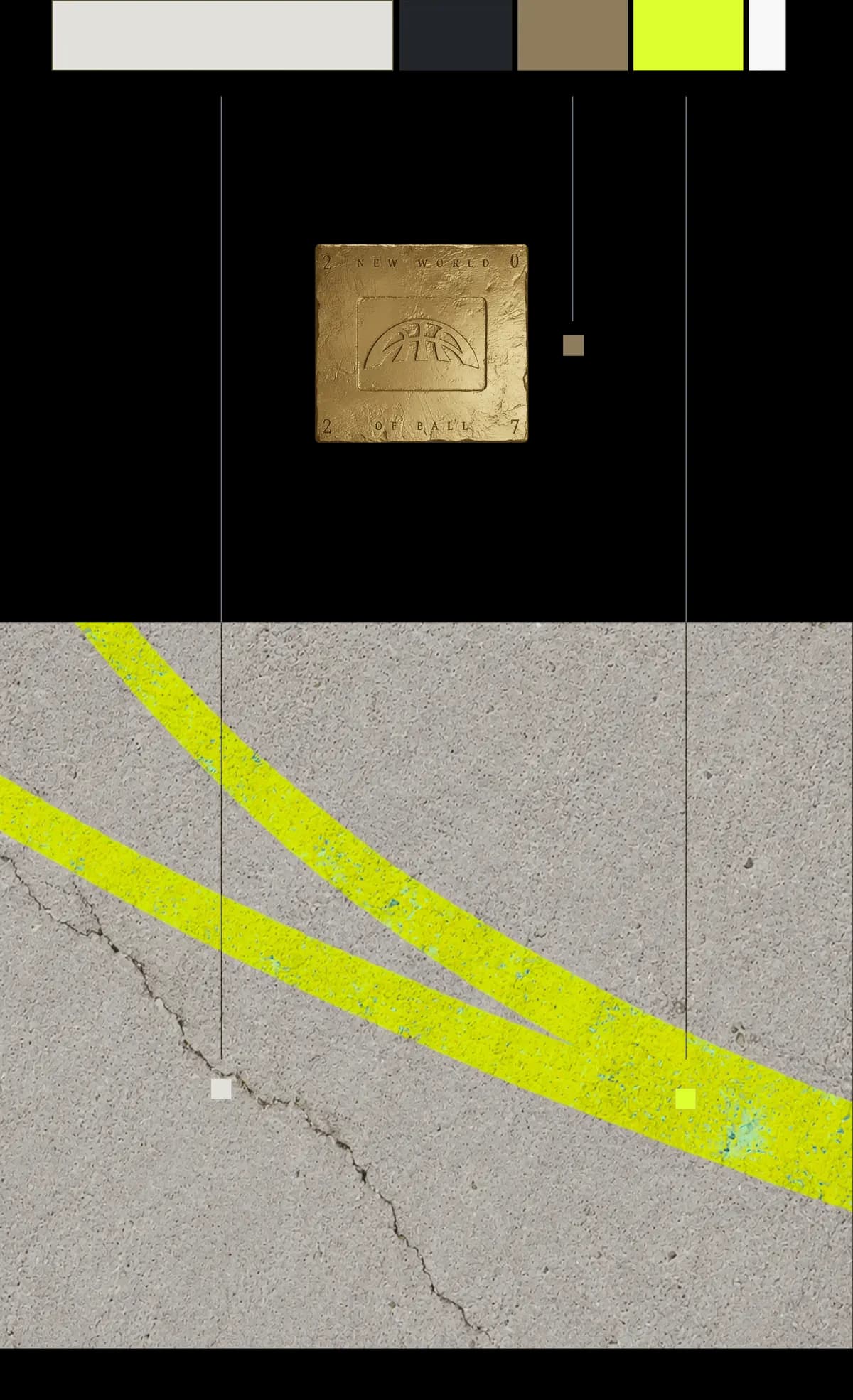
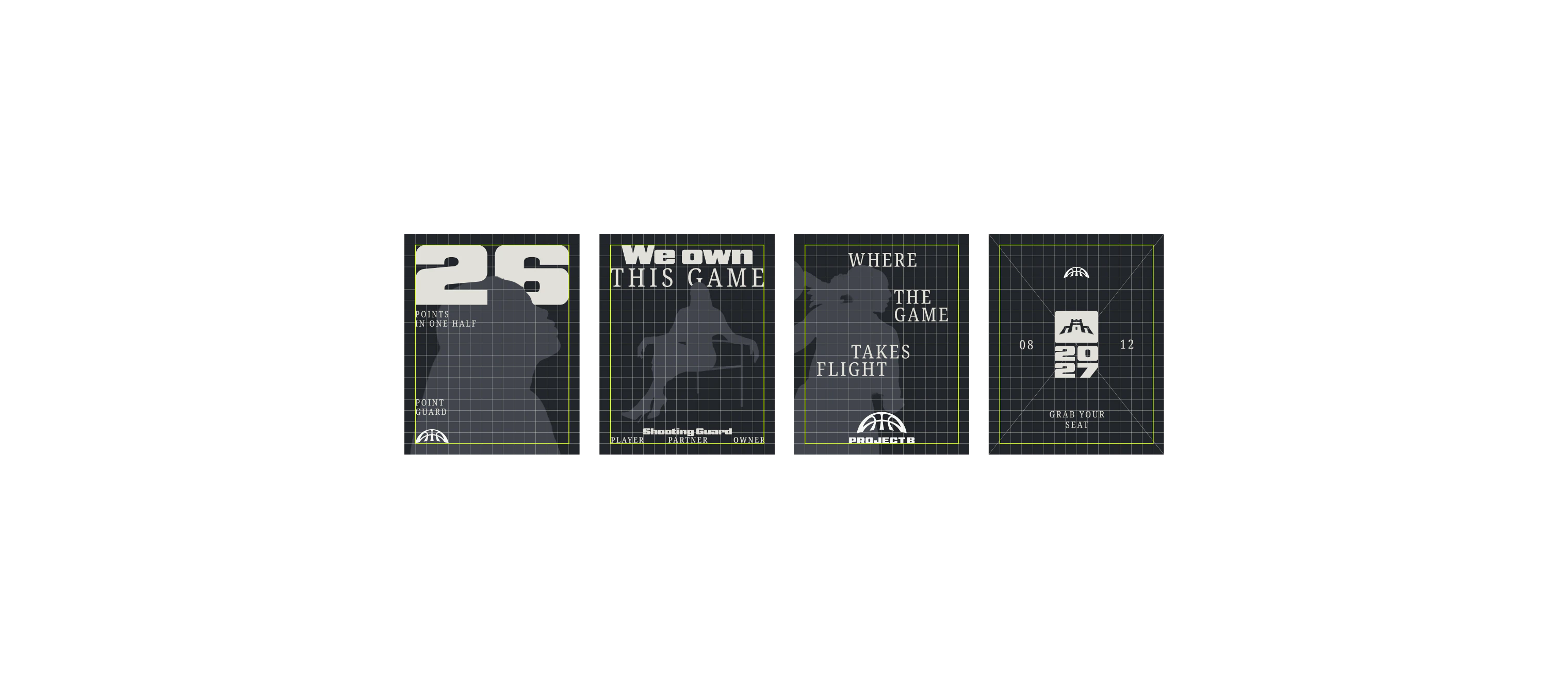
Refined colour palette

The balldoesn’tstop
at thebaseline
the new world of ball.
What was the deal?
Project B was a chance to reinvent how basketball feels. That was the exciting bit: breaking conventions that no longer reflect what the sport has become and changing how people see it.
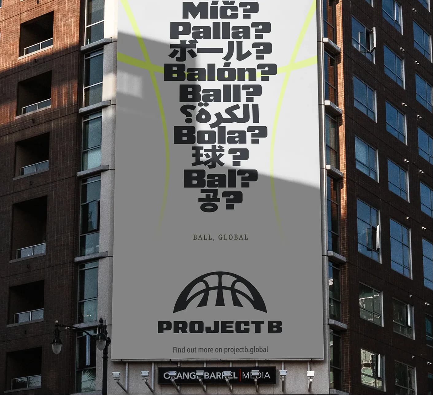
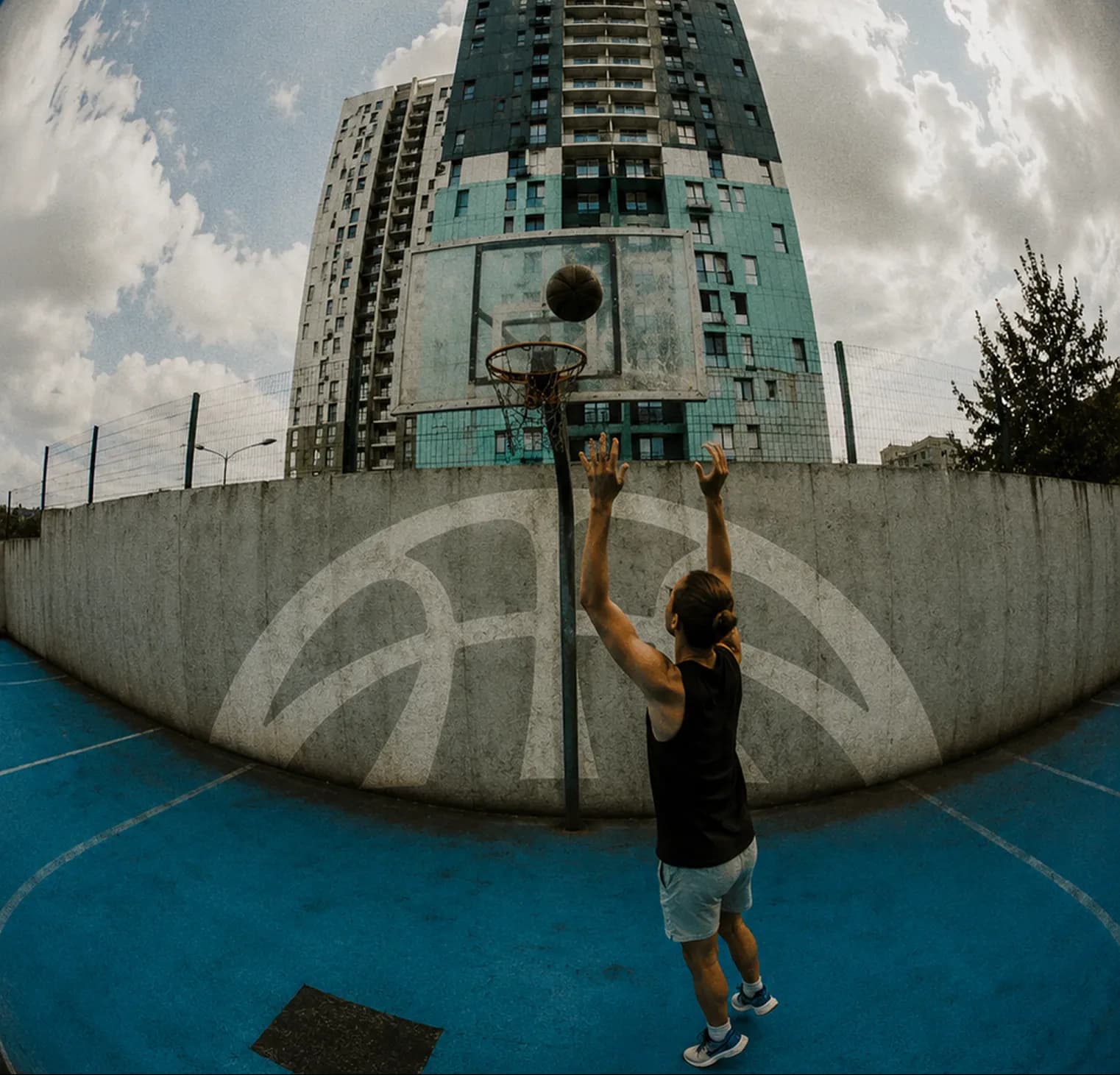
Basketball has traditionally had a very American and overly masculine feel. We wanted it to feel more global and open: a level playing field that reflects the changing energy of the sport, where female athletes aren’t simply included but are leading it. It isn’t just for one type of person anymore.
We got there by feeding off one another. Across brand, system, design and experiences, we created the freedom to make, break and share each other’s work. Something that had originated in one place was picked up elsewhere and given life. The idea became elastic, with a fluidity that felt counter to the way the basketball world looks at the moment.
The client knew their world and trusted us to know ours. They respected what we brought, and we respected what they knew. That meant we could have genuinely open and honest conversations, to push the work somewhere different and get to something we all genuinely believed in.
If the people making the work believe in it, that comes across. The work feels specific and real. Made for the people inside the sport and the new audience developing around it.
Tassia Swulinska — Creative Director