Heidi
Heidi:
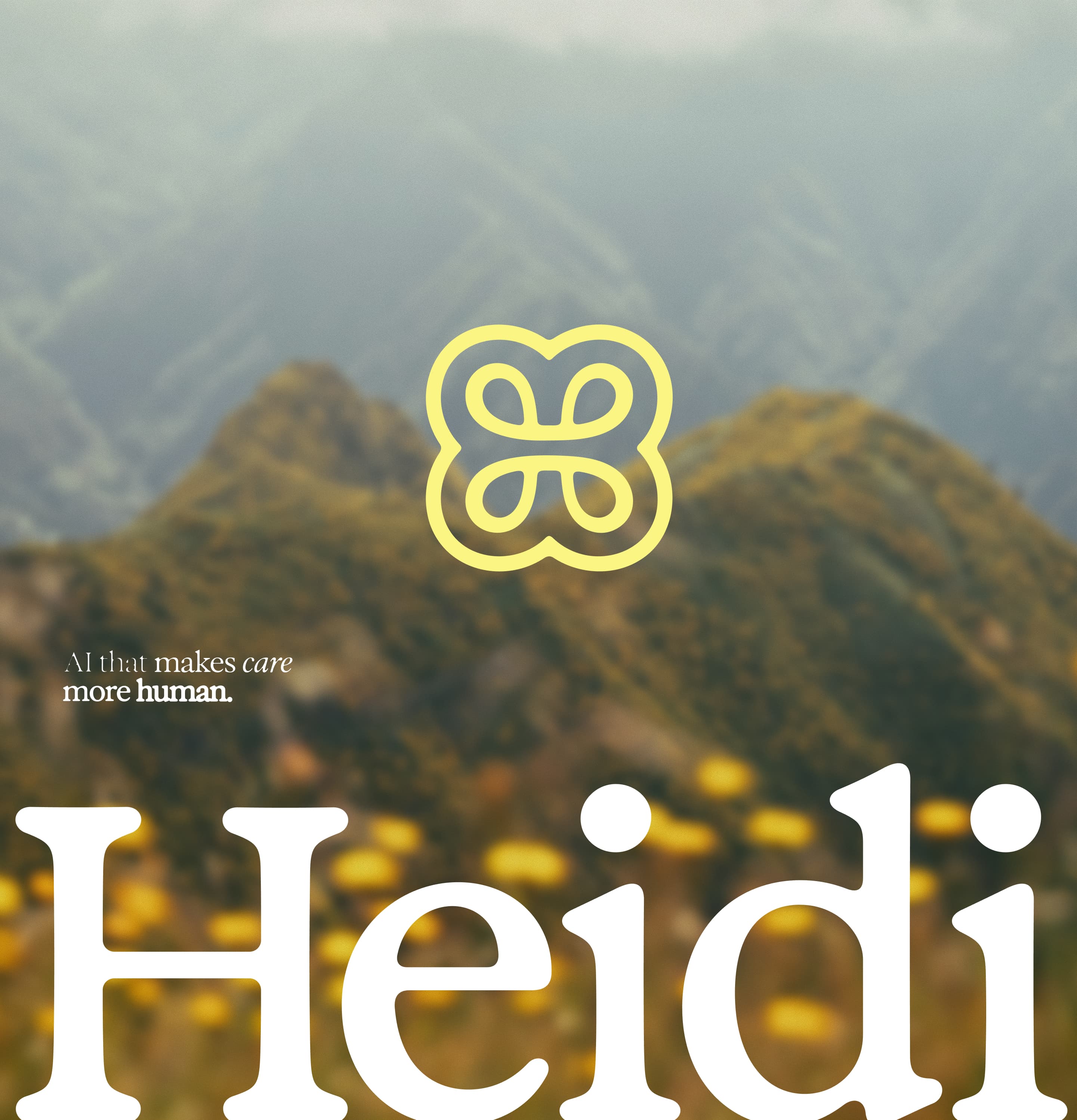
AI that makes care more human.
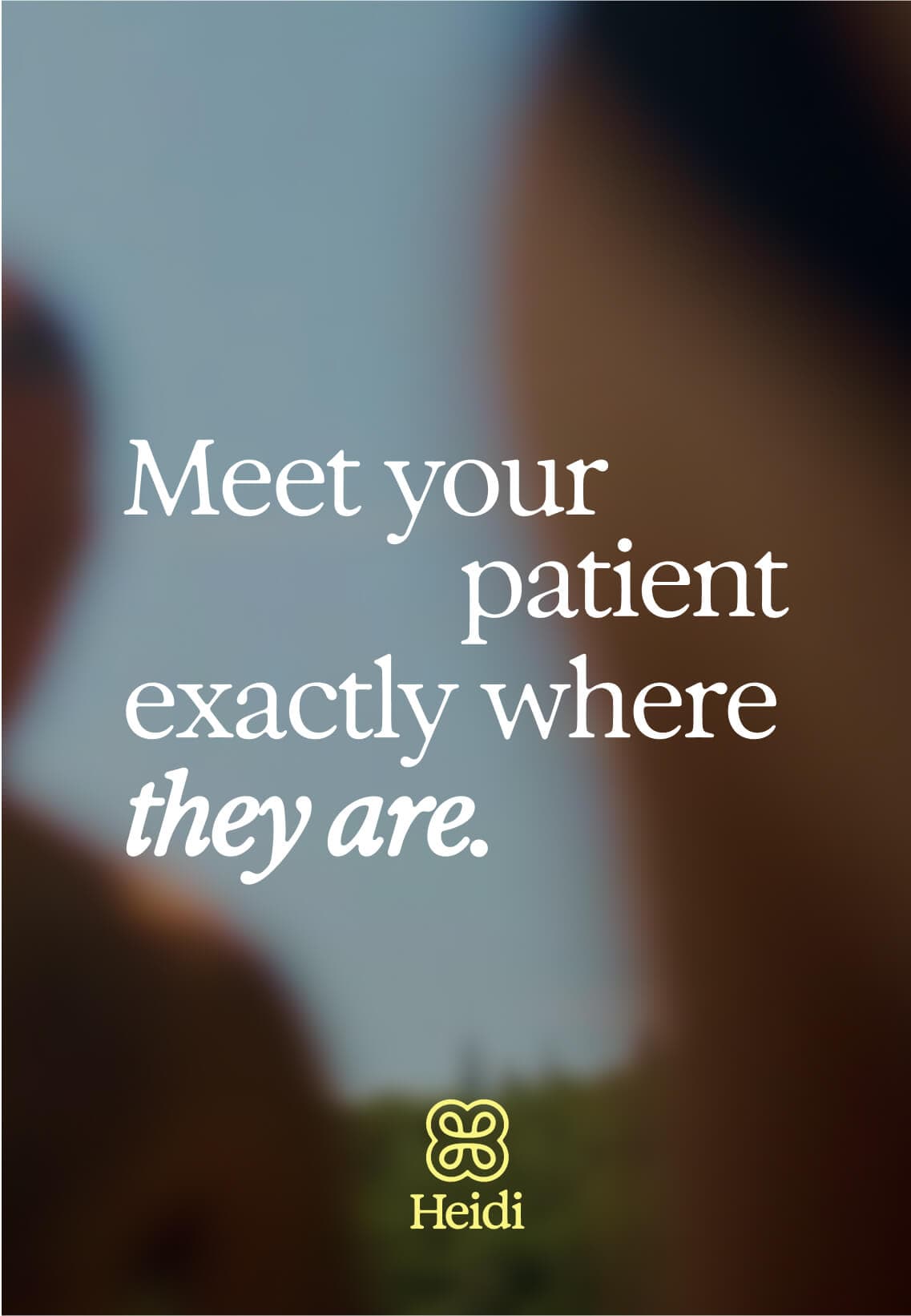
Right now, healthcare comes in bursts. clinicians and patients only have brief moments of contact in the room. care providers need a partner that can restore the rhythm of care.
That’s why heidi exists. to double the worldwide capacity for care and win clinicians’ trust. Heidi’s ai-powered products handle work in the background, so clinicians can be present in the room with the patient.
This is the future of healthcare: steady, precise, more Connected and more human.

Putting care back in clinicians’ hands.
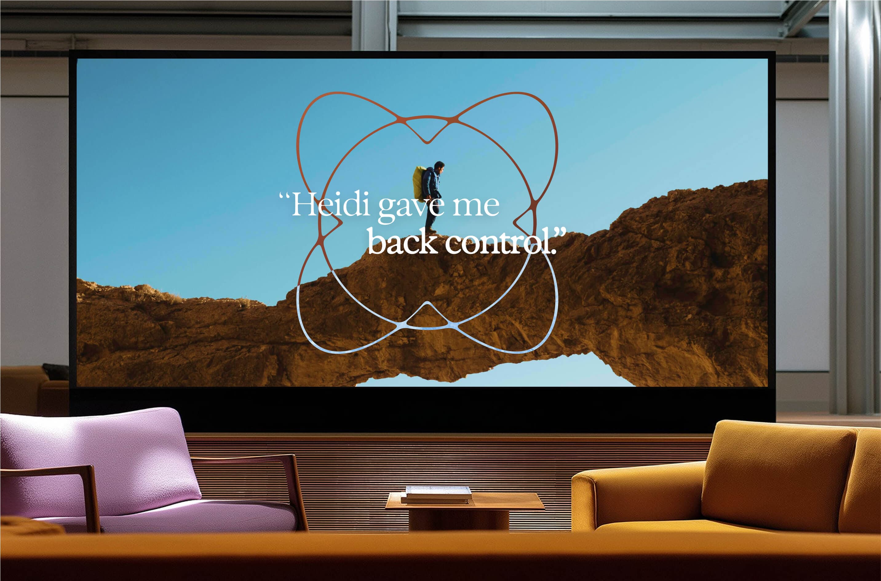
The new brand system positions Heidi as the indispensable partner to clinicians. Its AI gives back time, energy, and focus, so they can bring the personal touch back to care restoring a world where humanity is not an afterthought, but the very reason for care.

Humanity, Harmony, Heidi.
While competitors lead with technology, Heidi’s brand is centred on the humanity it serves. In close collaboration with their team, we crafted a design system that connects empathy with efficiency, bringing ease, relief, and delight to every interaction.
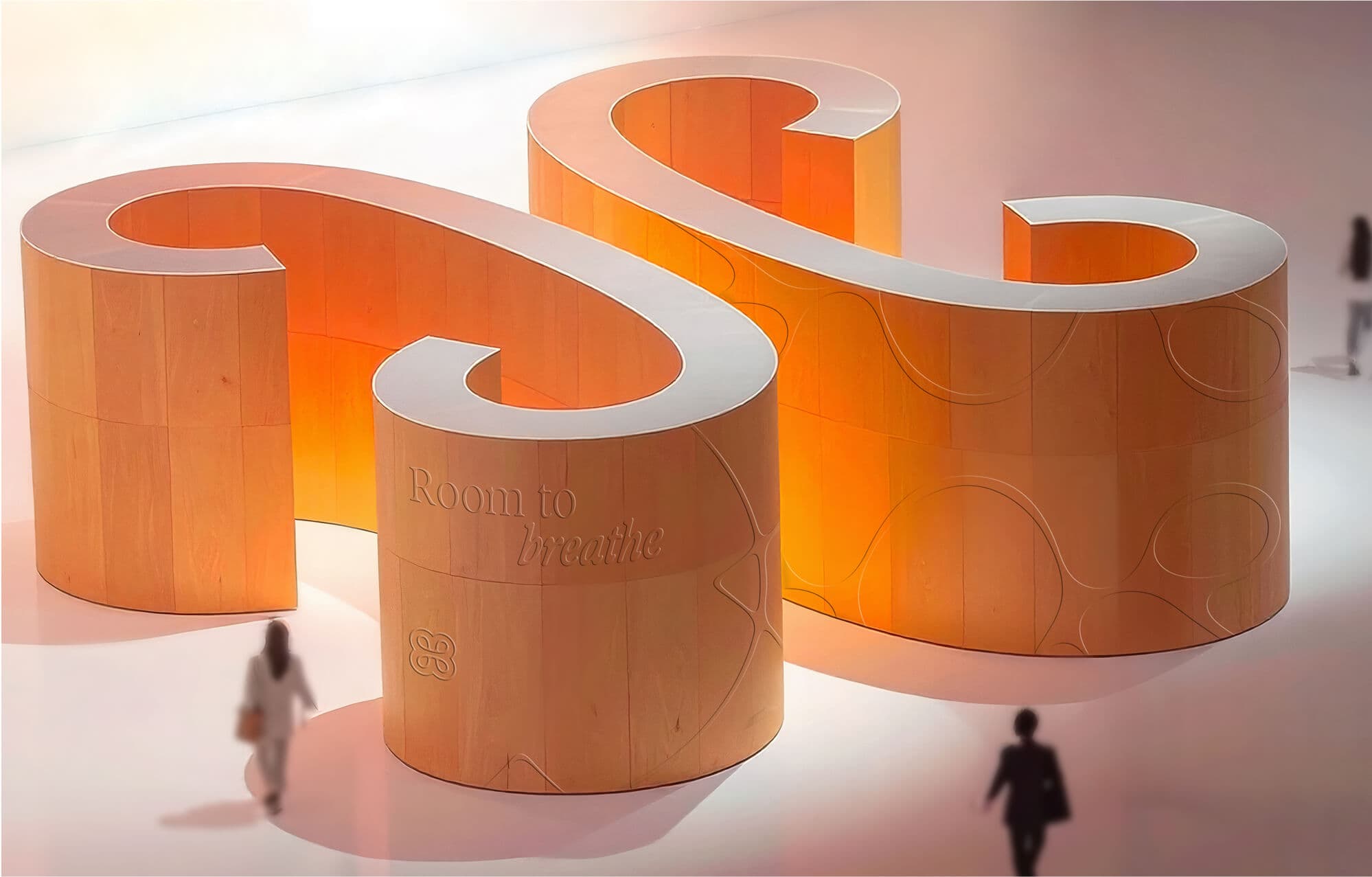
Heidi isn’t just a tool. It’s room to breathe, to find clarity, to restore rhythm. A brand experience where care is not only exceptional but deeply human.
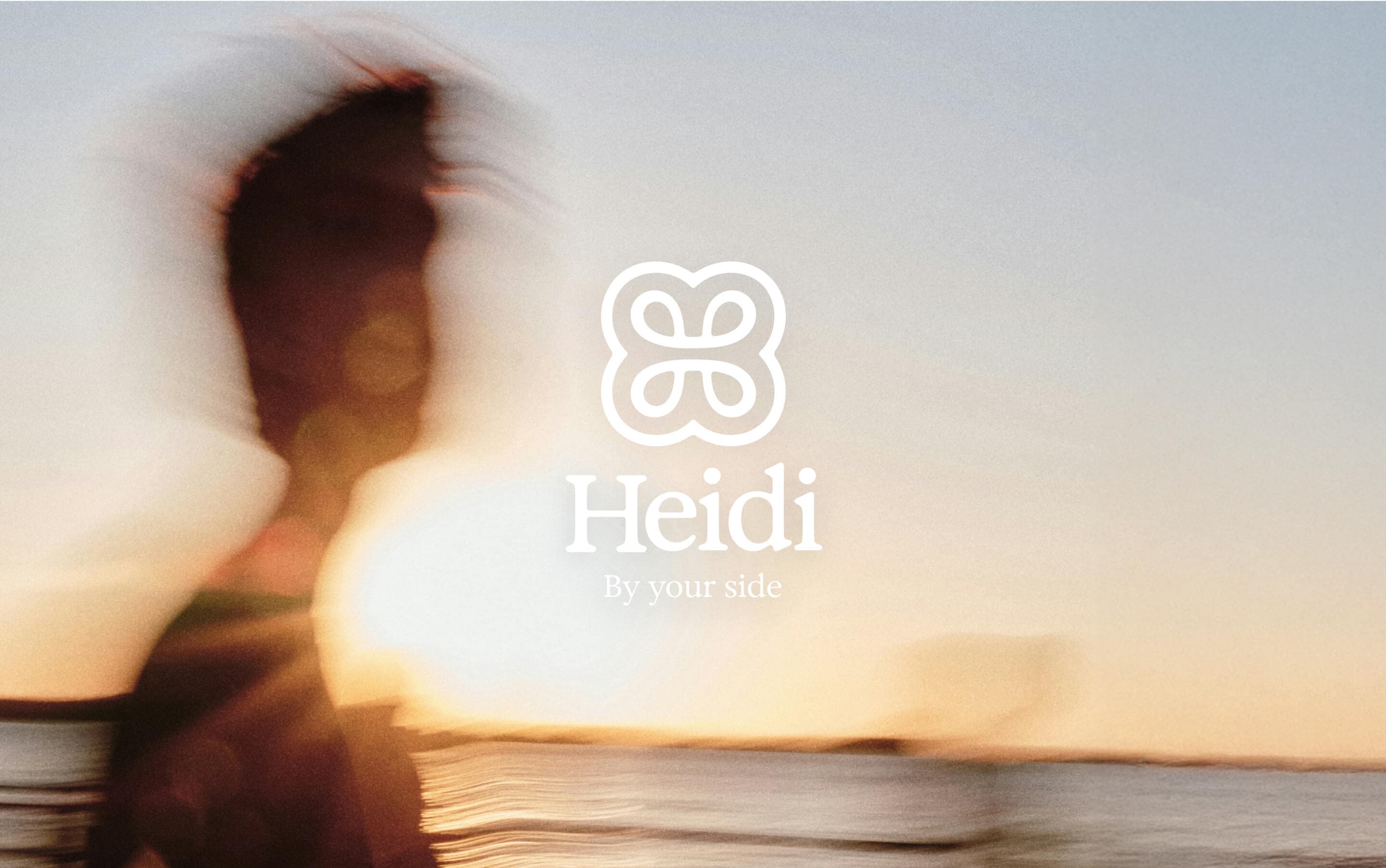
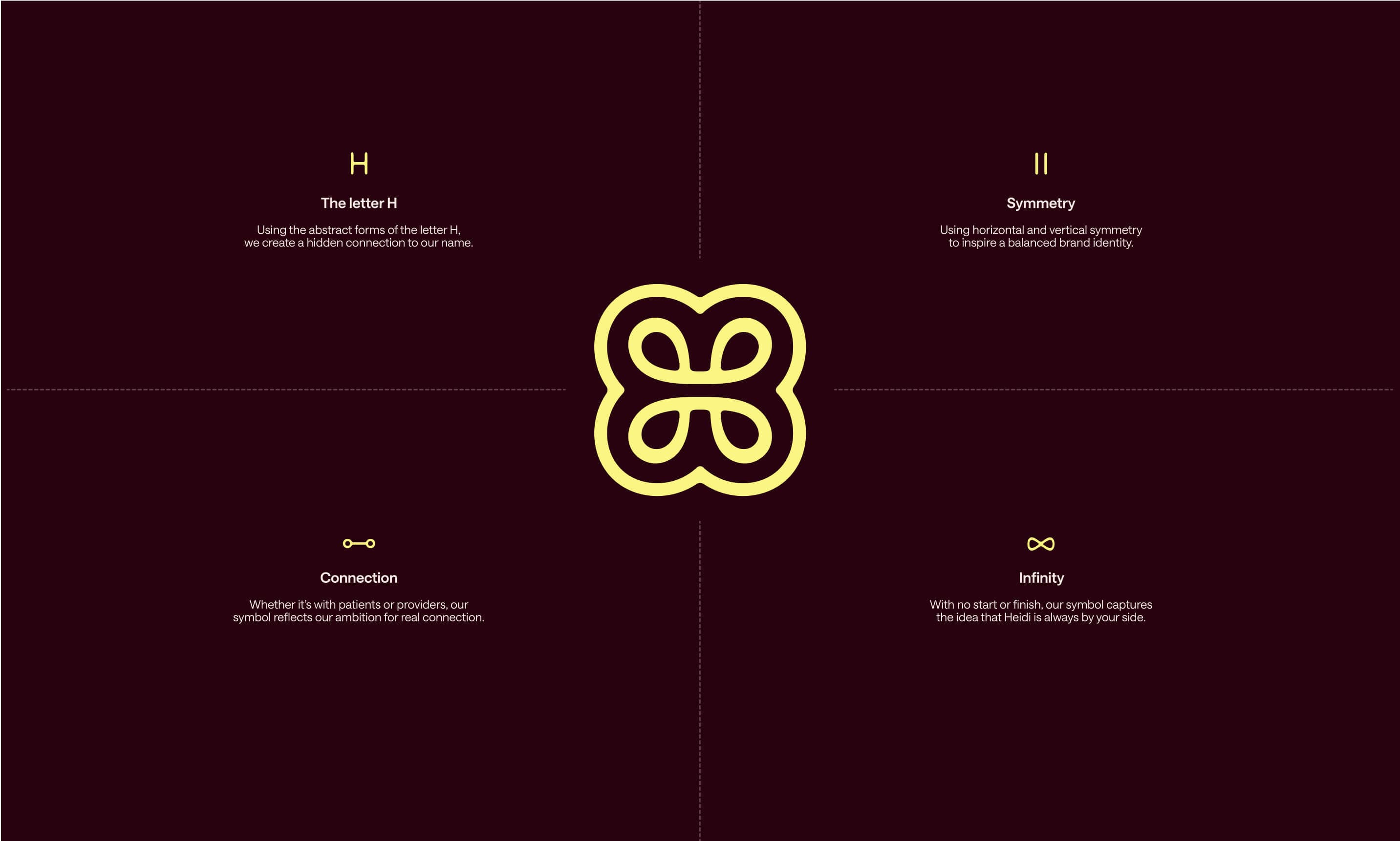
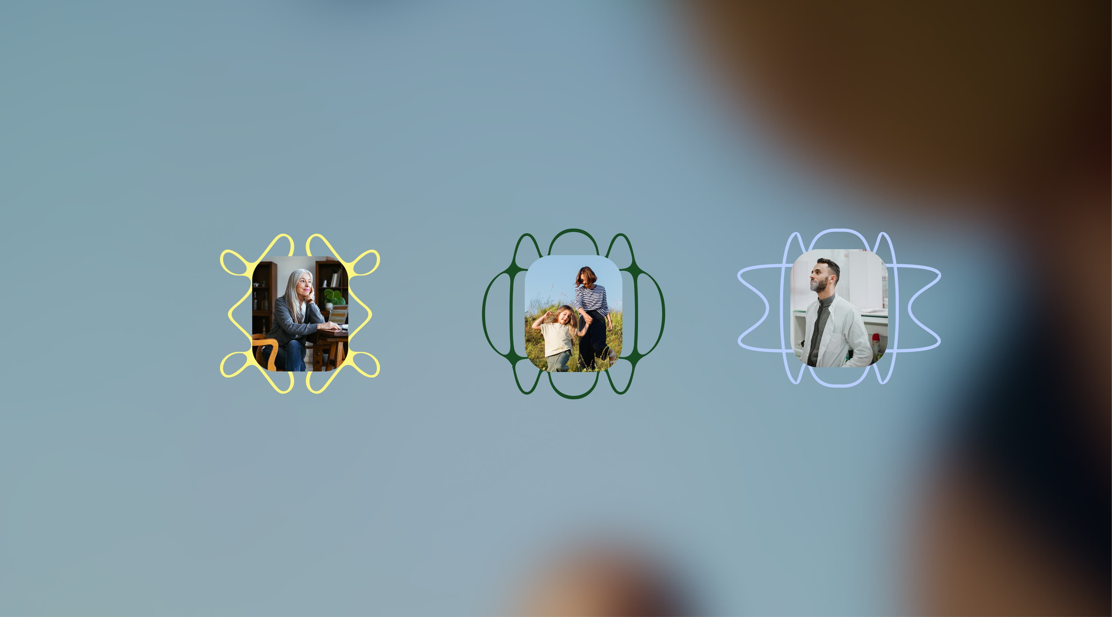
A symbol of balance.
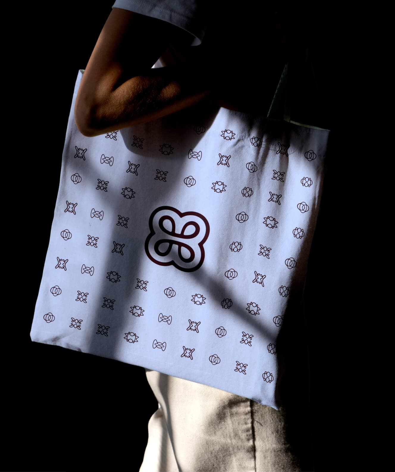
Born from the ‘H’ in Heidi, the logo is crafted around flowing symmetries that embody balance, connection, and care without end. Inspired by nature and shaped by human craft, it represents the harmony between technology and empathy.
Every curve and intersection reflects equilibrium, trust and humanity in perfect alignment. Designed to adapt, it’s a mark full of meaning: a distinct and recognisable entry point to the brand. A symbol that reminds us Heidi is always by your side.

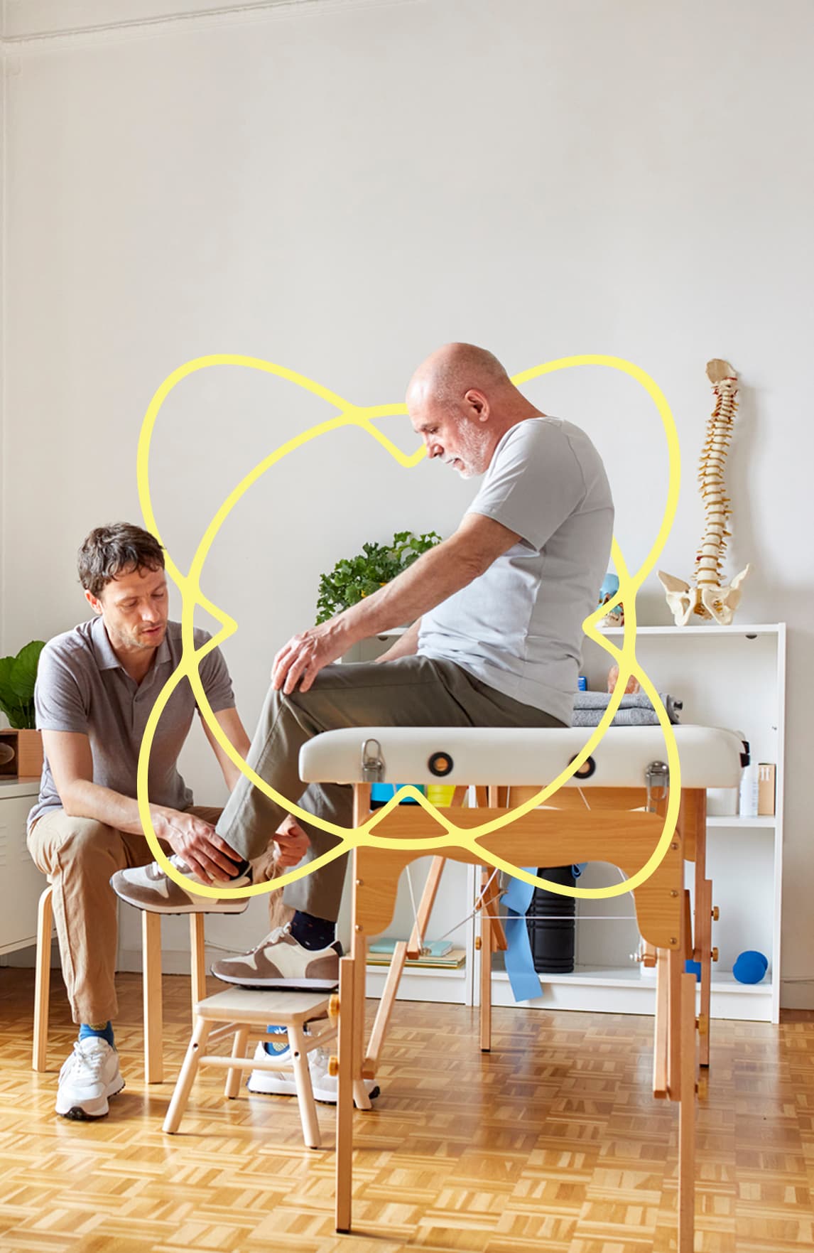
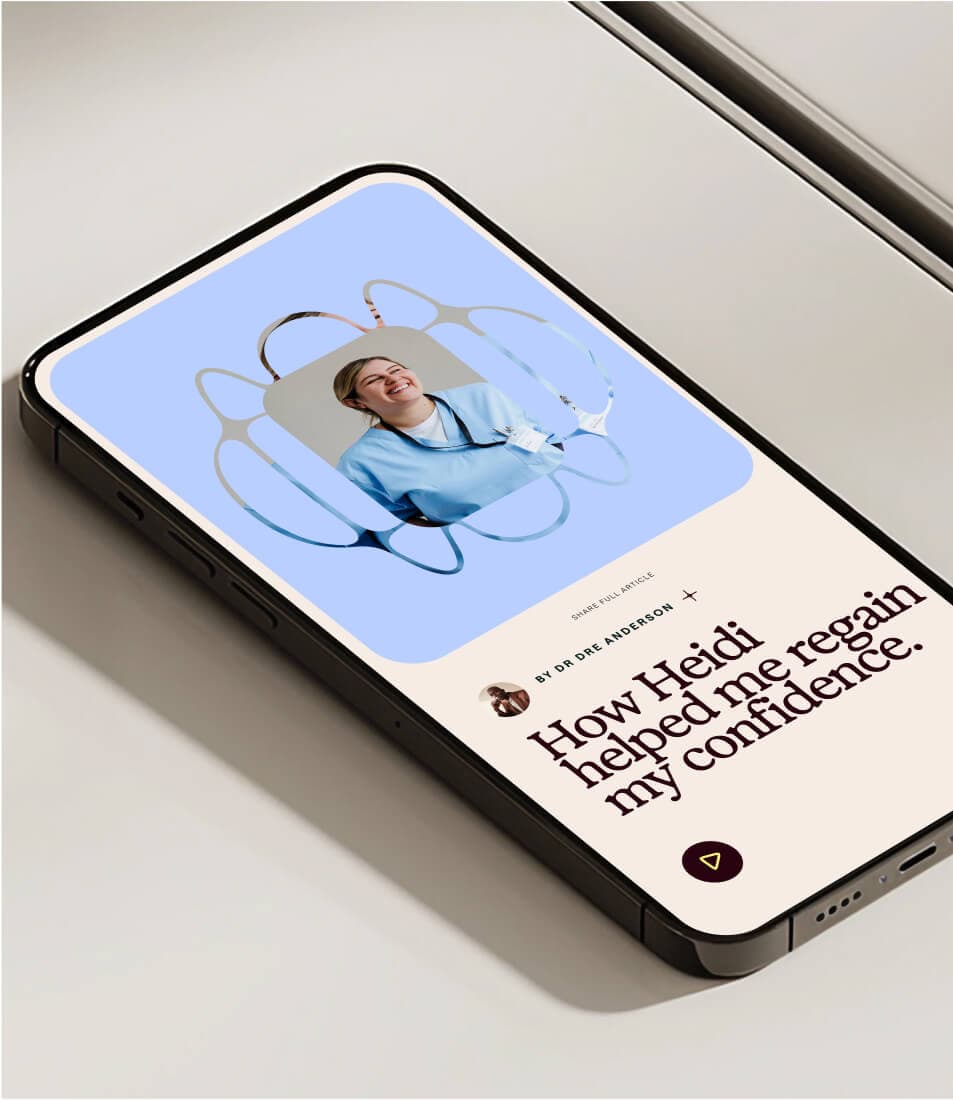
A system inspired by ripples of connection.
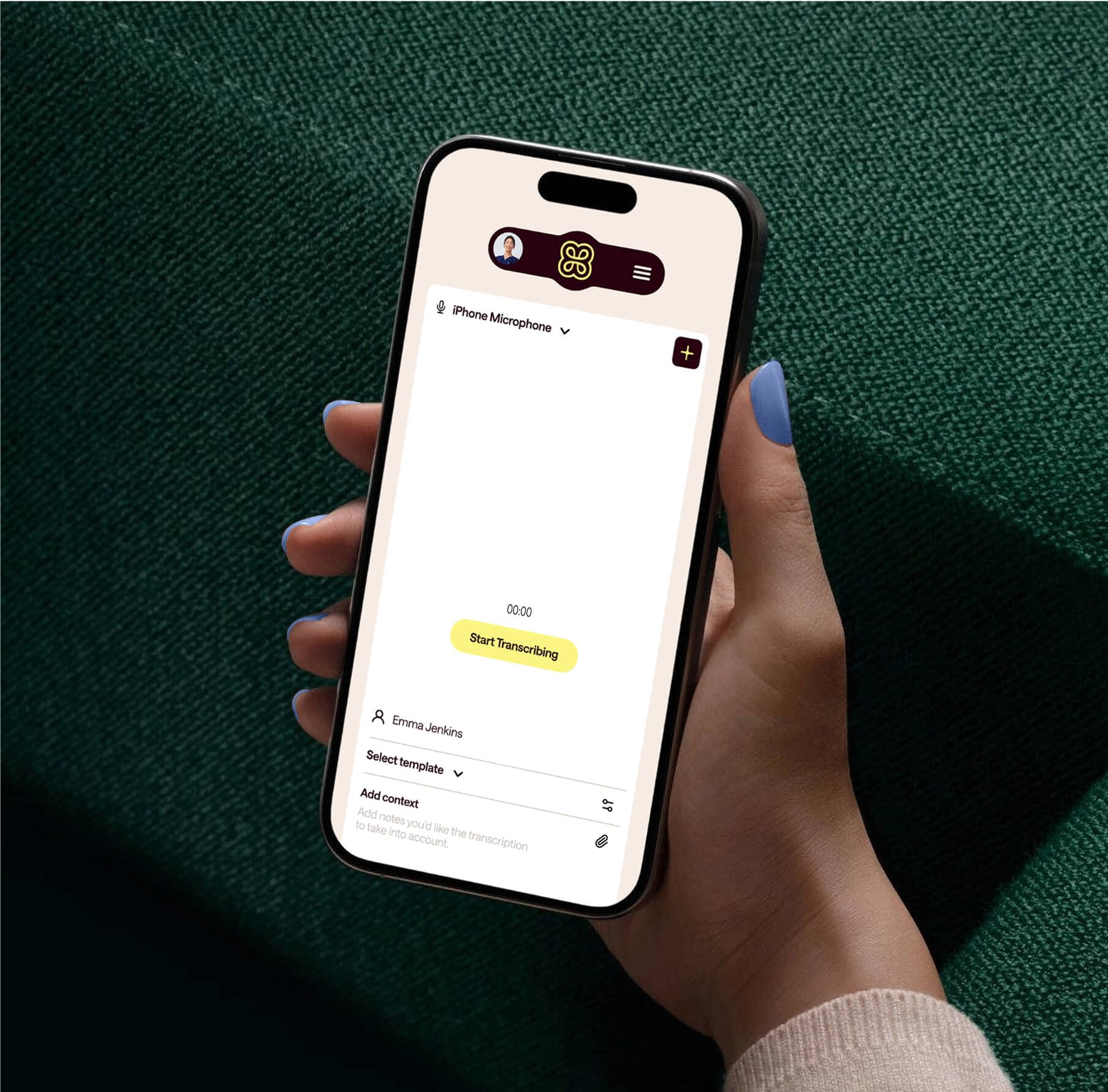
The human voice is central to Heidi. it can transcribe conversations between clinicians and patients, so clinicians no longer have to interrupt meaningful discussions to take notes.
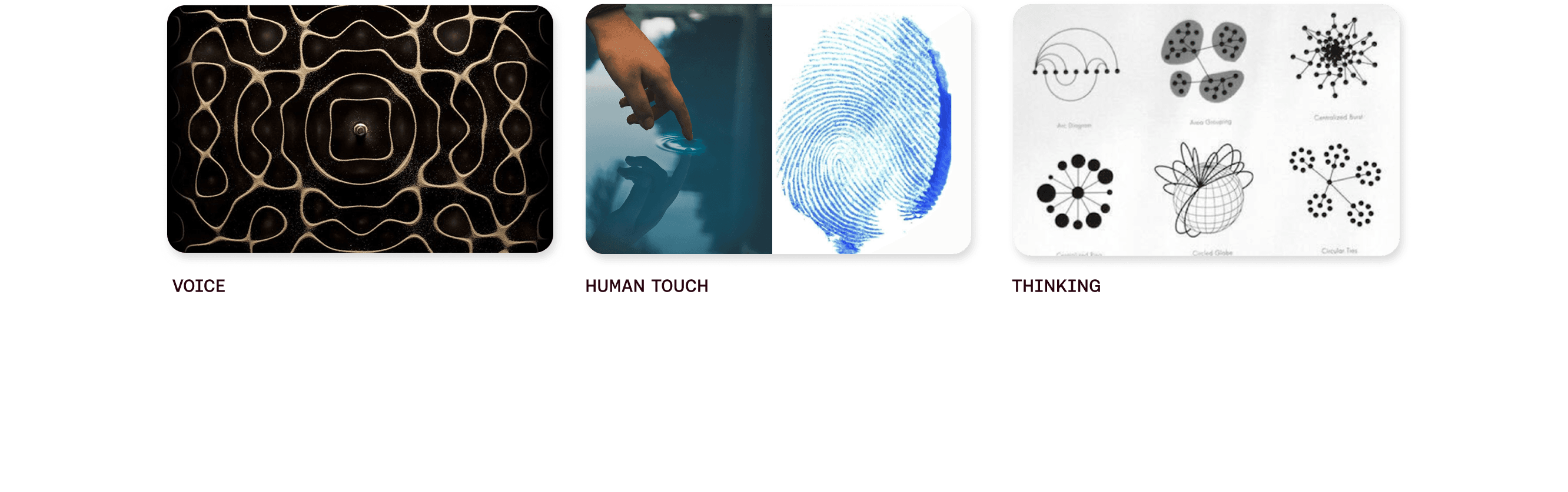
We created a suite of patterns and motion behaviours Inspired by the cymatic patterns that sound vibrations create, as well as zen gardens and ripples in water. They convey the thoughtfulness, tactility, and flow that define human interactions at heidi’s core.


Infused with subtle details.
Details mean everything in healthcare, so we created a suite of assets that bring each element to life with the same care and attention. the organic flow and weight of our logo become the building blocks of our bespoke patterns, iconography, and pictograms. They add touches of our visual language across every moment to guide users intuitively through the experience.

unveiling healthcare’s next step.
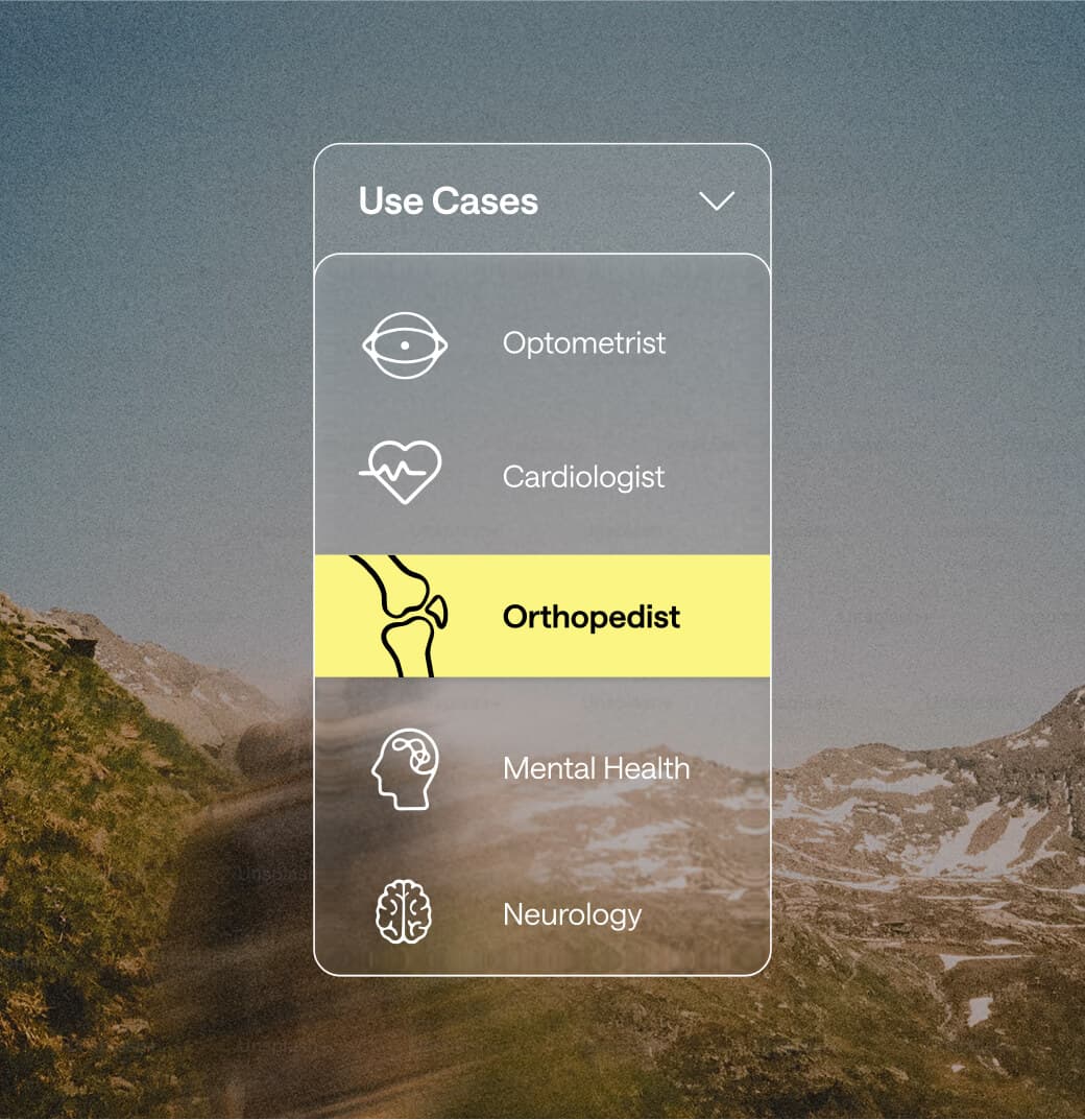
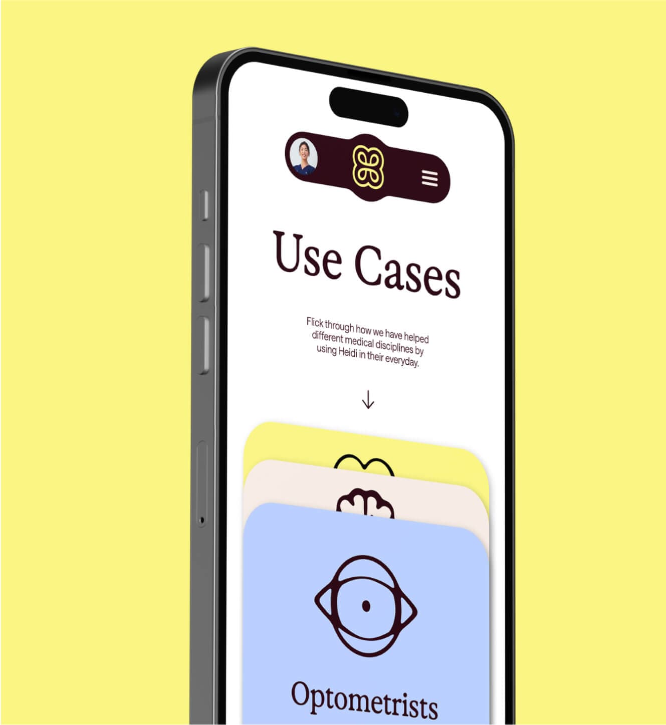
The new brand system brings scale and meaning to Heidi’s impact in the real world. With over eight million hours returned to clinicians each year and more than two million patient consultations supported every week, it reflects a company built to serve those who care for others. Designed to feel natural, intuitive, and intelligent, the system helps clinicians trust and connect with Heidi as an essential part of their daily rhythm. Across more than 200 medical specialties, it creates a sense of calm precision. Technology that works in harmony with people.

Backed by $65m of series b funding, Heidi health now supports over 340,000 consultations each week in the uk, in the new era of care.