Inception42: brand identity by DixonBaxi
Optimised for desktop

A G42 Company





Intelligence is the vision to lead.
The people making the biggest decisions today
are dealing with more complexity than ever. AI is supposed to make that easier. But too often, it just adds more tools, more information and more noise.
Inception42 takes a different approach.
It helps organisations see clearly, decide confidently and create impact at scale.

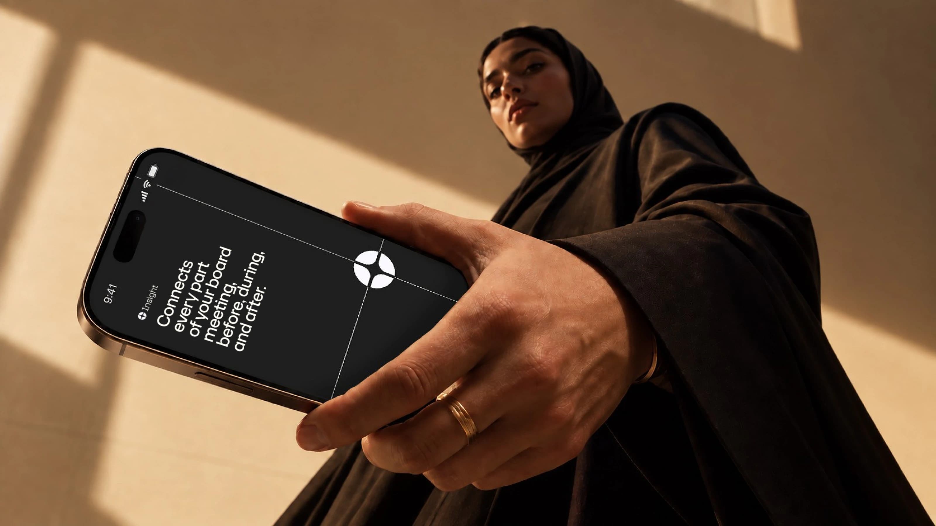
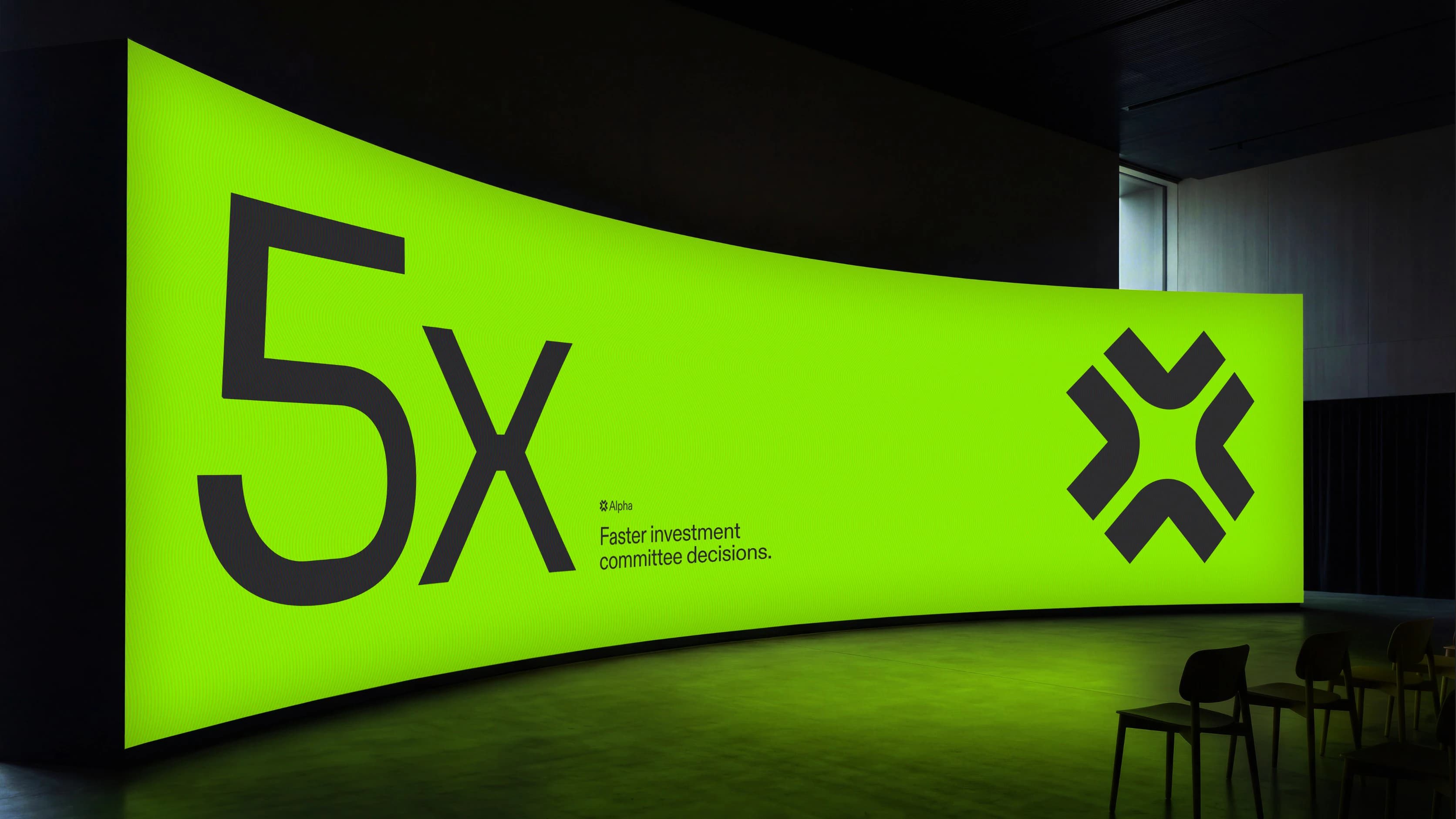
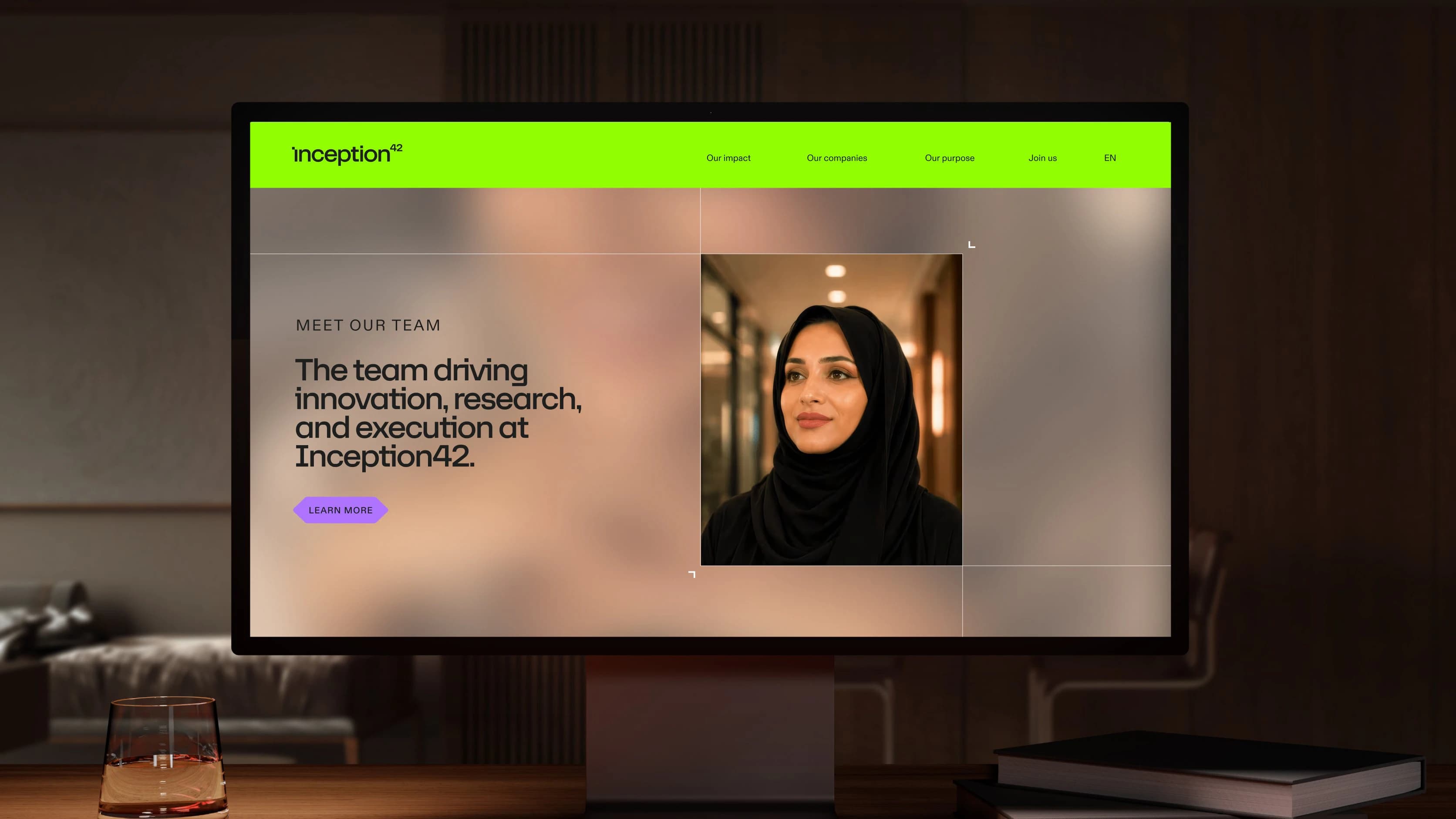
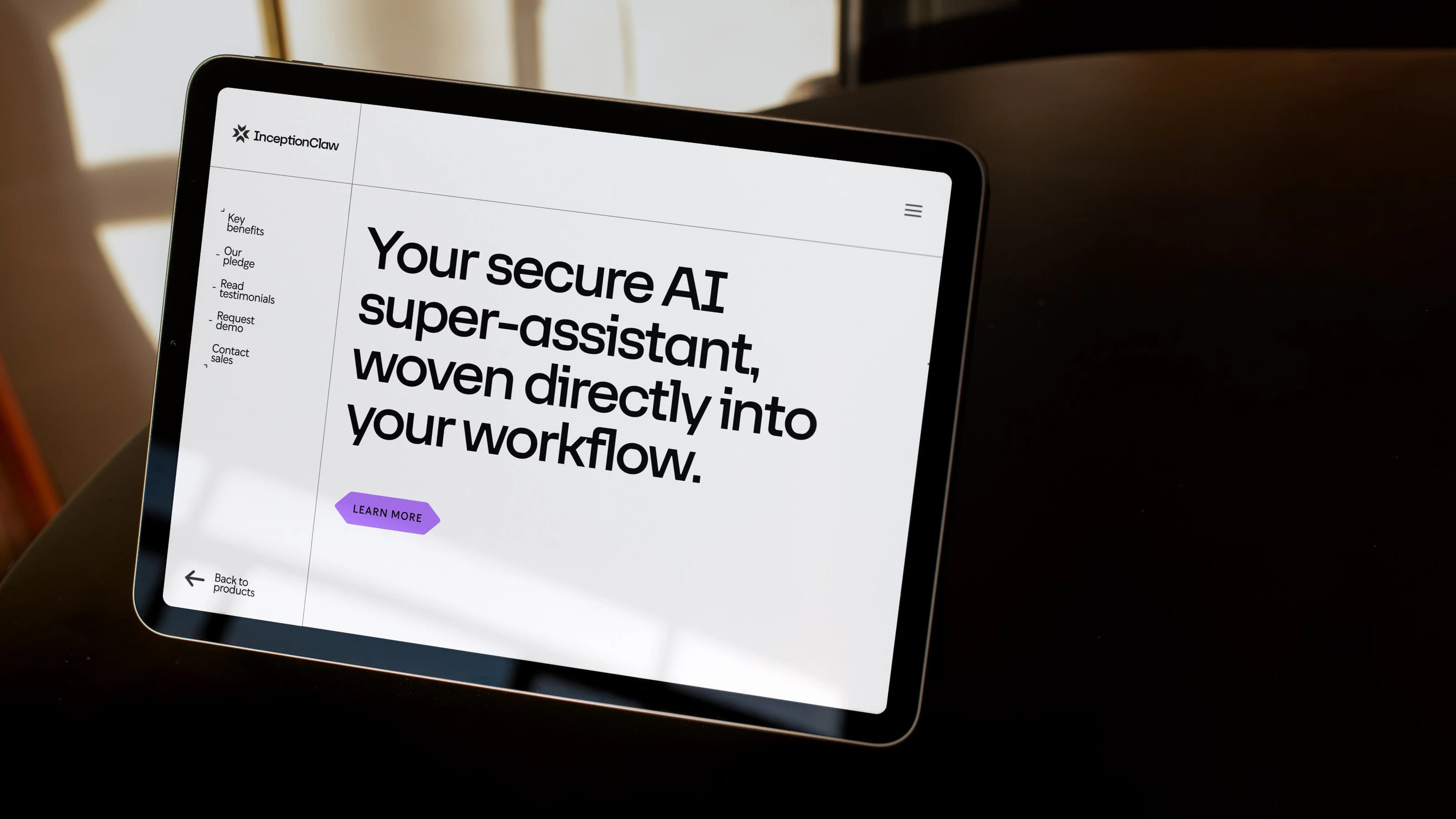

The idea is simple: AI-native. People-led. Because the best decisions still need a person at their centre.
One system
Multiple products
Inception42 brings together a
suite of AI tools designed to turn raw intelligence into decisive action for organisations and governments. The technology is powerful, but it never gets in the way.


clear-space140px
Inception point clear-space
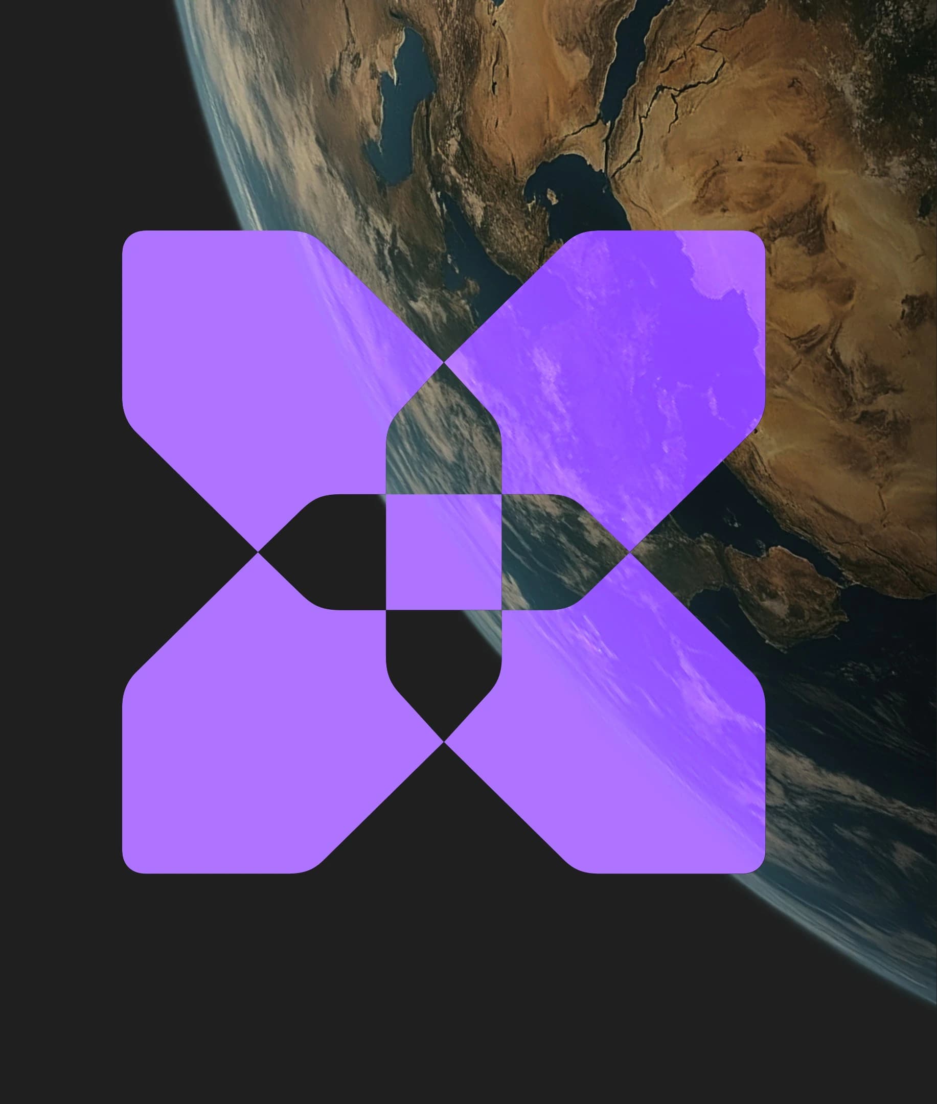
At the centre of the brand is
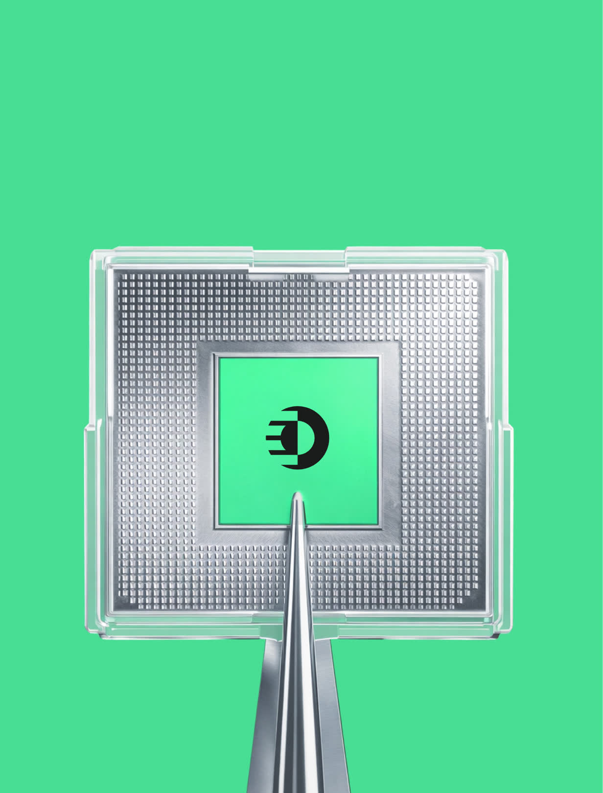
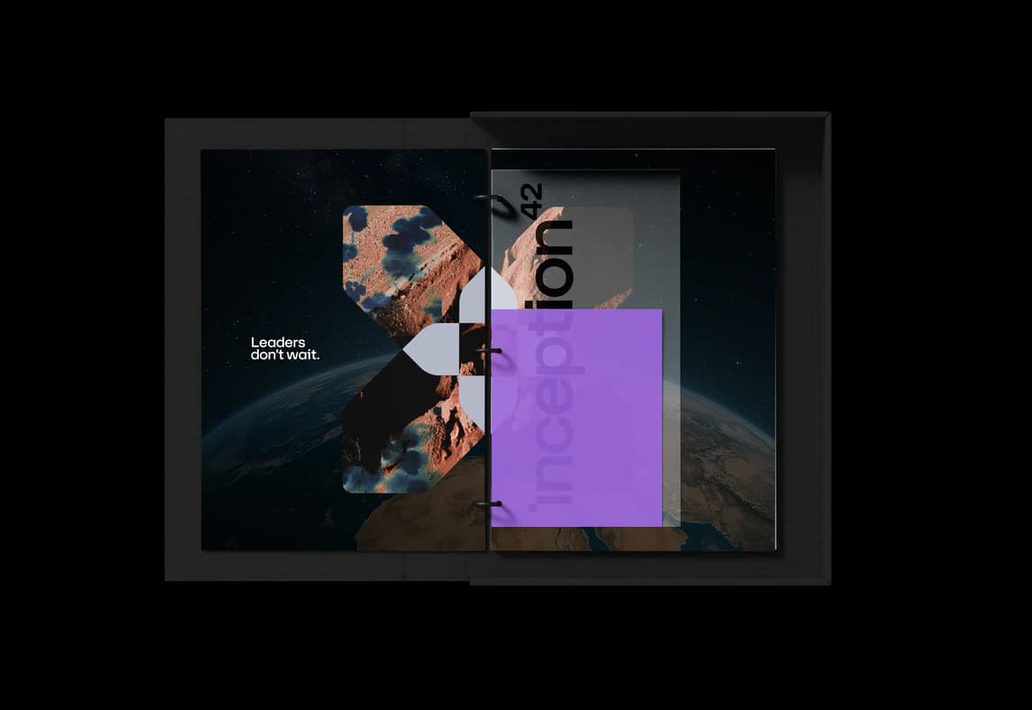
the Inception Point. It’s the moment when intelligence becomes insight, and insight becomes action.

One Point
Infinite Possibility
A visual language that can bring order to complexity, while still feeling open, accessible and full of possibility.
Possibility Research Discovery Data Compute Learning Models Reasoning Systems Agents Infrastructure Performance Growth Transformation Industries Future Discovery Iteration Learning Connection Capability Adaptation Evolution Reach Opportunity
Intelligence Scale Growth Acceleration Impact
Quiet confidence. Technical elegance. A sense of warmth.
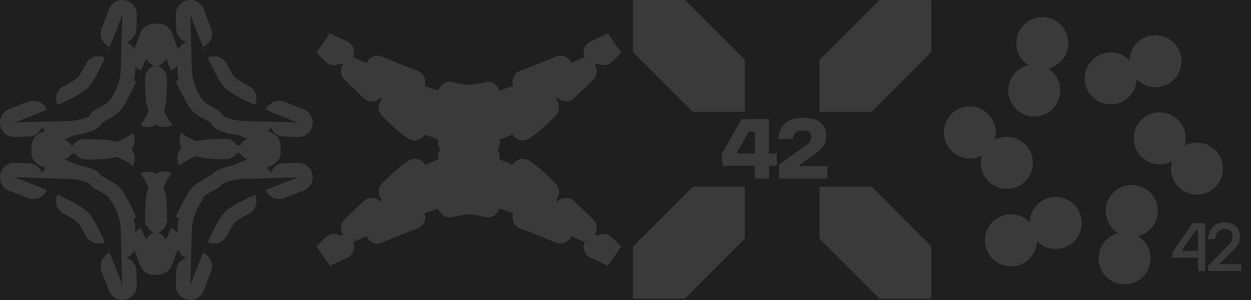
Reflecting the industry

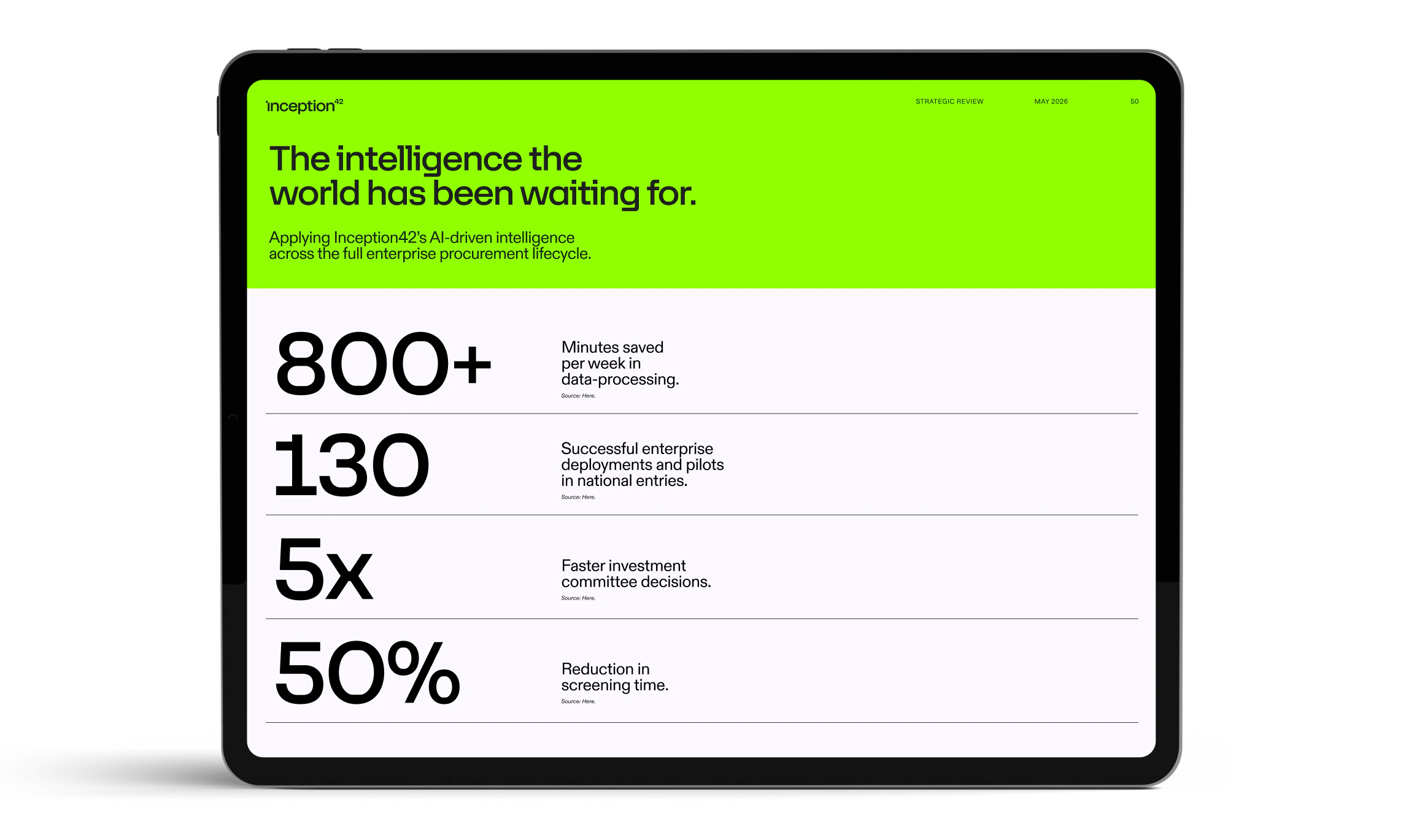
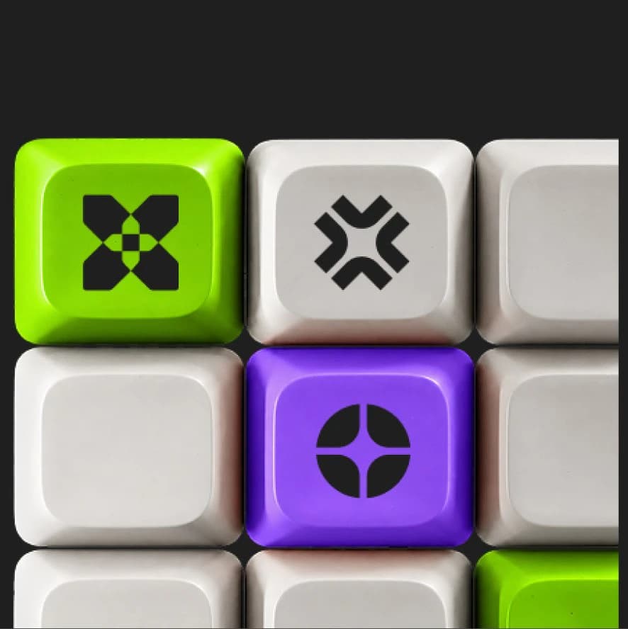
Our palette is bold and vibrant. Built to reflect the intensity and energy of AI.
Technical
Grey
Intelligent
Purple
Progress
Green
Clarity
White
Foundation
Black
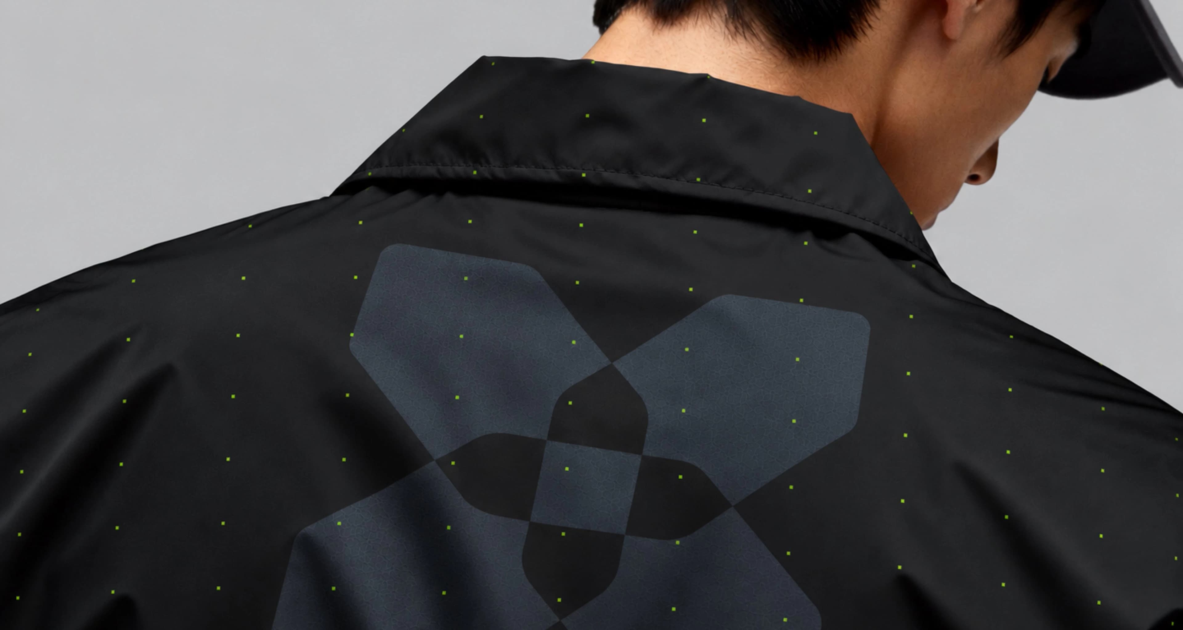
Vision
Intelligence


The result is a brand designed to grow with Inception42 — and a new way of imagining what AI can make possible.
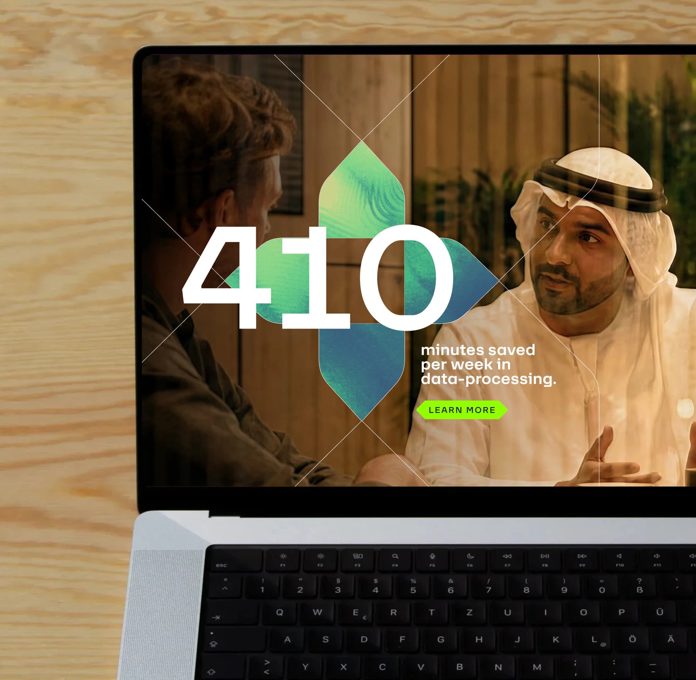
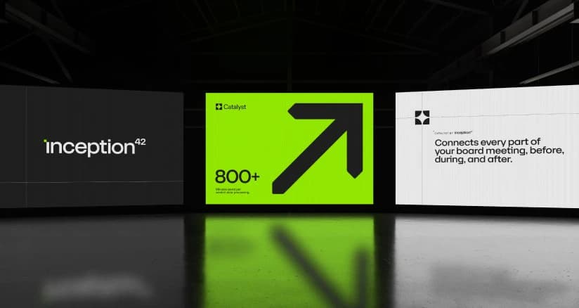

The pointer is constructed from two elements of equal width, joined at a 90° angle

Our typographic family

Combining character with precision
Unlocking Clarity



Slab-inspired detailing results in engineered character and a close link to our pointers device.
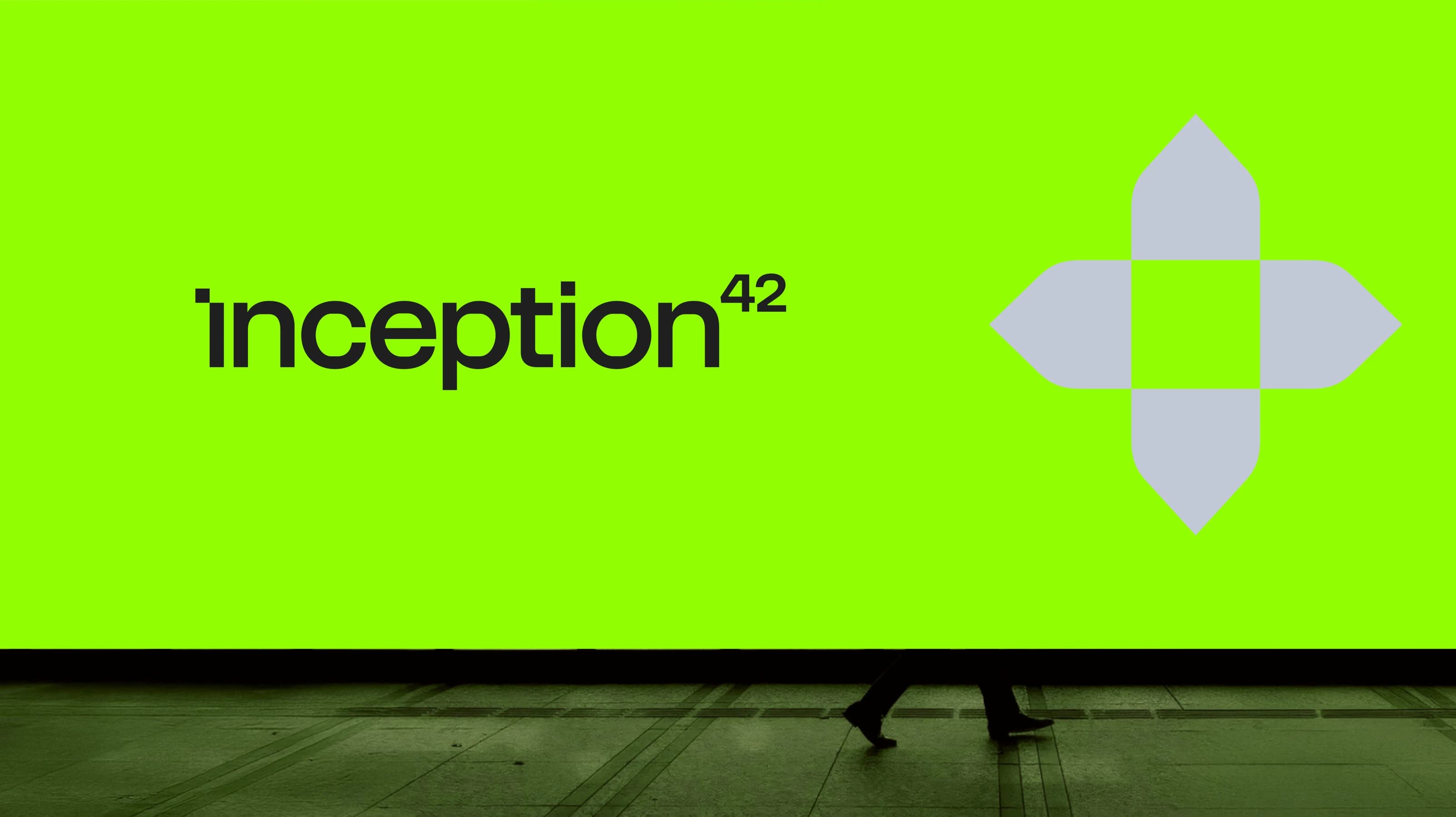
The Inception42 Point -
detail from our logo.
Sharp cuts create more geometric letterforms
Rounded details add unexpectedness and warmth





What was the deal?
What excited me was the potential already inside Inception42: the ambition, proven technology and scientific depth to become a defining global AI brand.
The challenge was to give that a clearer point of view and a presence to match where the business was heading.
We wanted a brand that felt bigger than AI conventions: confident, human and purposeful, making their intelligence feel relevant to people making huge decisions.
What I love is that the idea became more than a line on a strategy page. It gave the brand a centre of gravity and something everyone could build from.
Gauri — Senior Strategist
The Inception Point gave us a rich idea to explore. I love working with detail, so I was drawn to the technology’s hidden structures, bringing them to the surface through grids, layers, movement and composition.
We made around 70 logos before finding the right one. The process became a real collaboration with the client. As trust grew, so did the ambition and our freedom to keep pushing.
The result feels genuinely true to Inception42: precise and technological, with personality, warmth and people at its centre.
We gave form to what made Inception42 different, then pushed it into something bold, coherent and ownable.
Bere — Designer