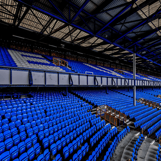
Everton
Everton:
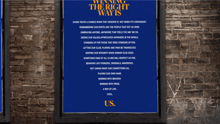
Winning the right way.
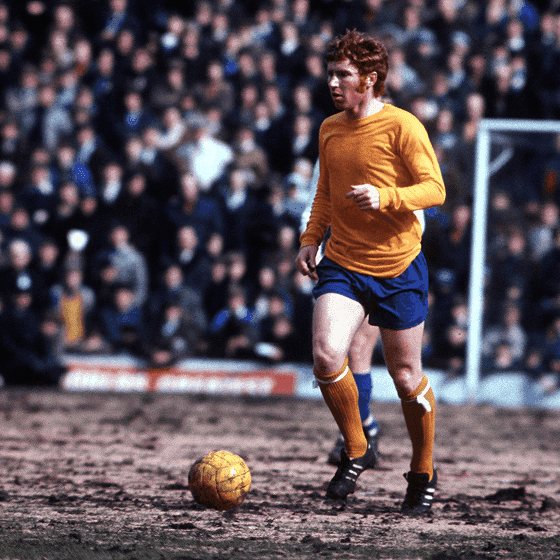
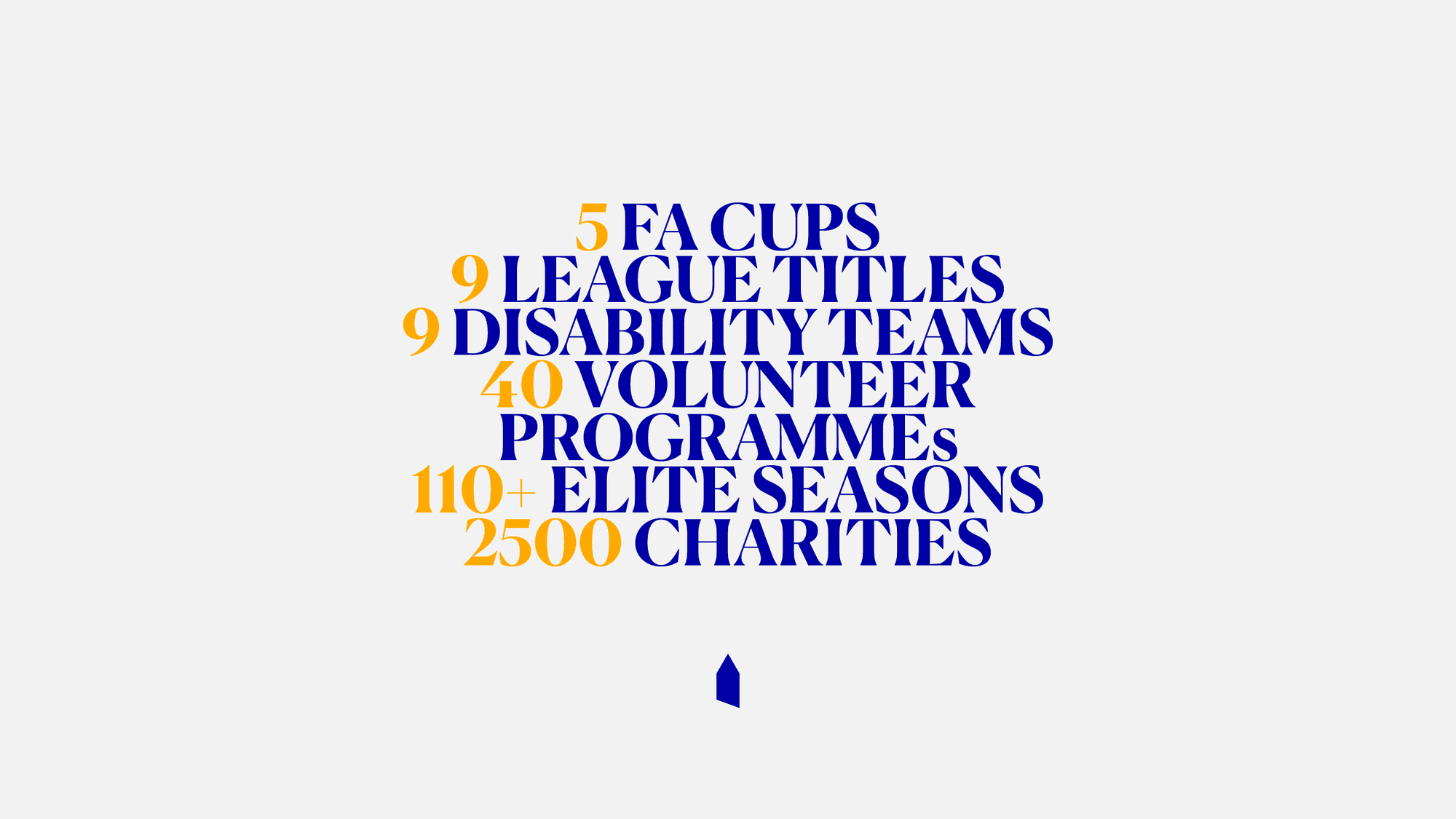
One of the founding clubs of English football, Everton has shaped the game for over 140 years. Known for its fierce loyalty, community spirit and a relentless commitment to doing things the right way, the club stands for more than just football. We created a brand system rooted in that rich heritage, bringing together the global Everton family and signalling a bold, digital-first future. It’s a brand built on blue blood, crafted for a new era of the People's Club.
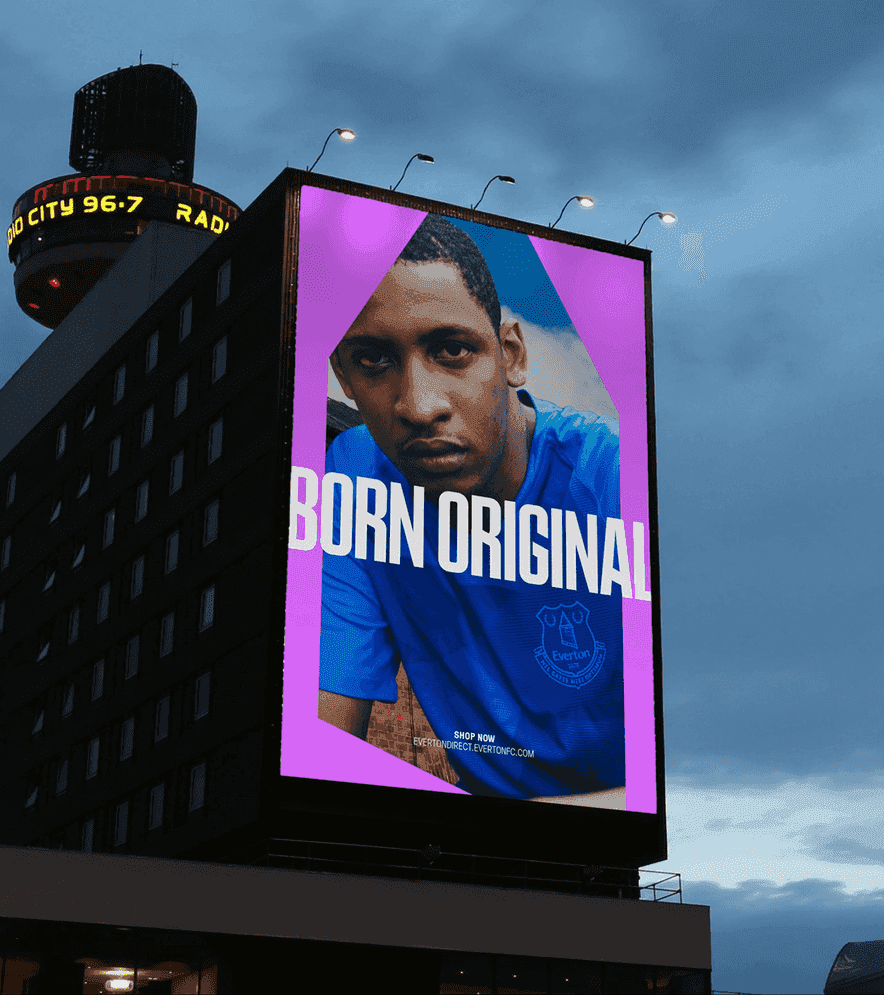
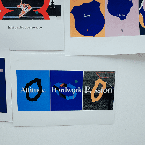
Elite, Not Elitist.
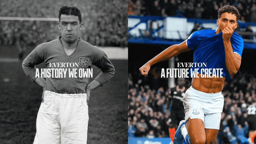
Everton has always led by example grounded in integrity, loyalty and ambition. Tapping into the history we own and the future we create, the new brand reflects a club that is elite, not elitist. It’s bold, unapologetic and rooted in strong values. designed to give Everton a powerful, unified voice that honours its legacy while welcoming a new generation of fans into the experience.

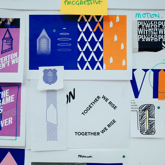
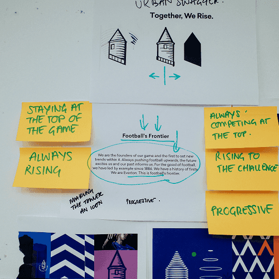
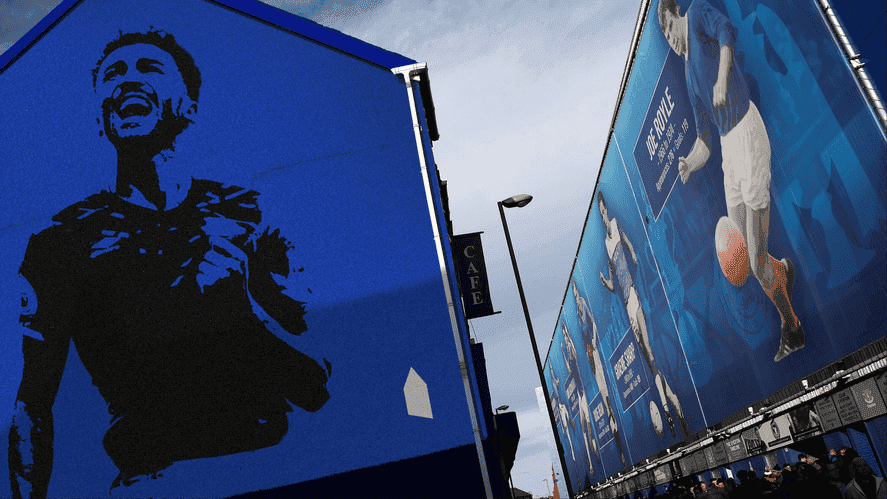
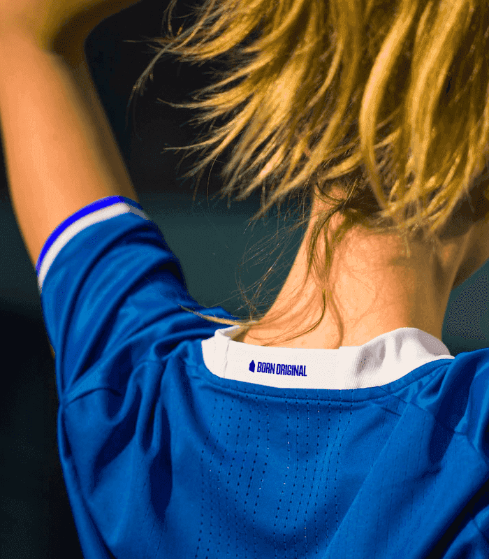
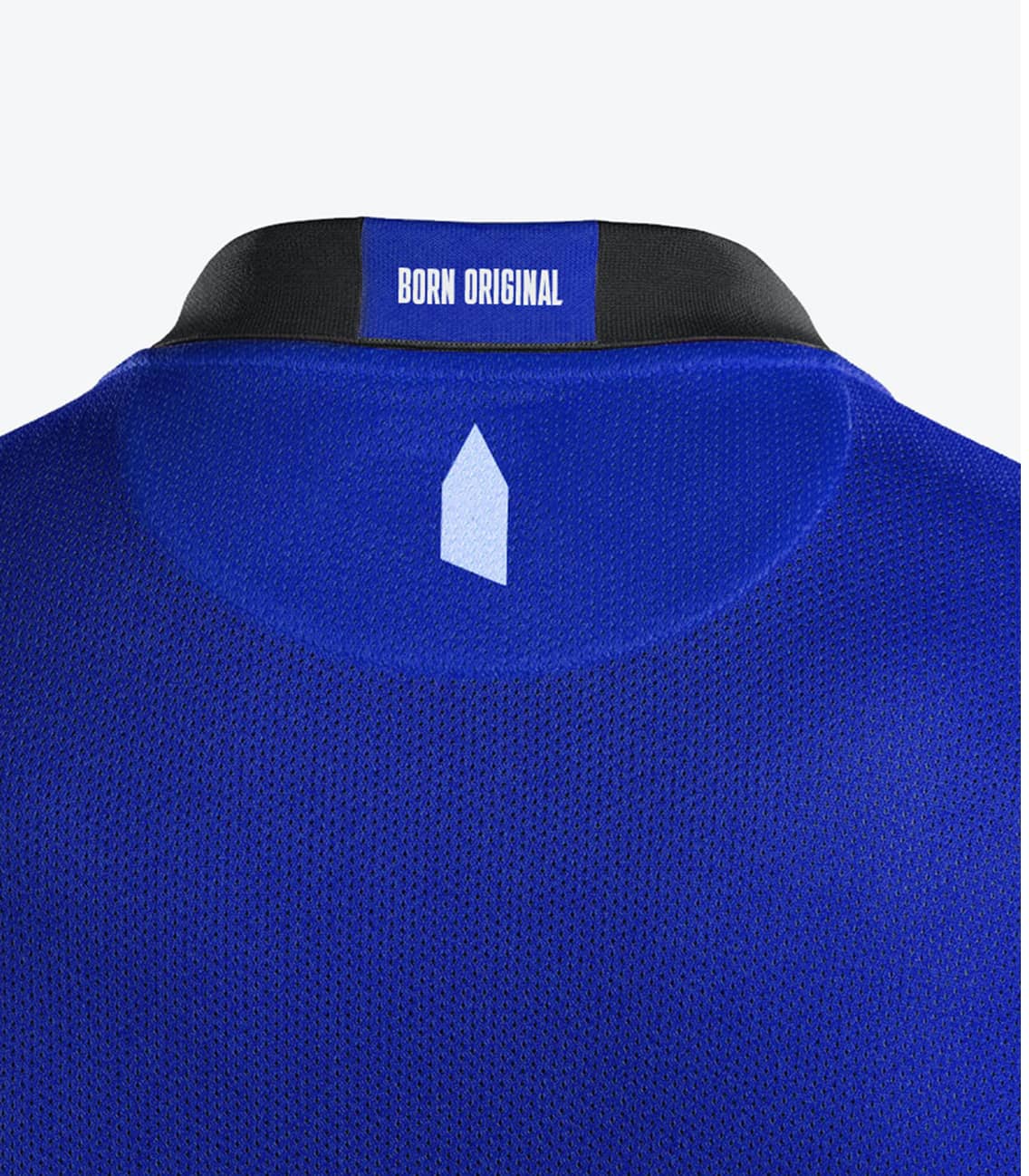
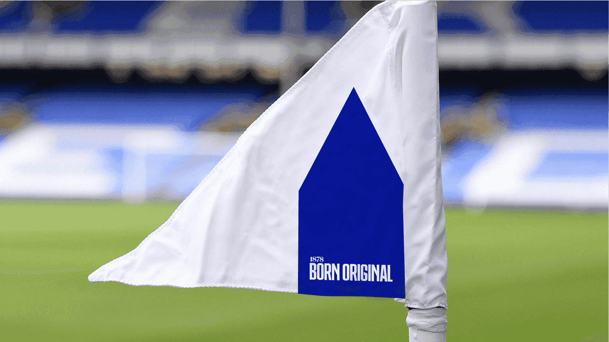
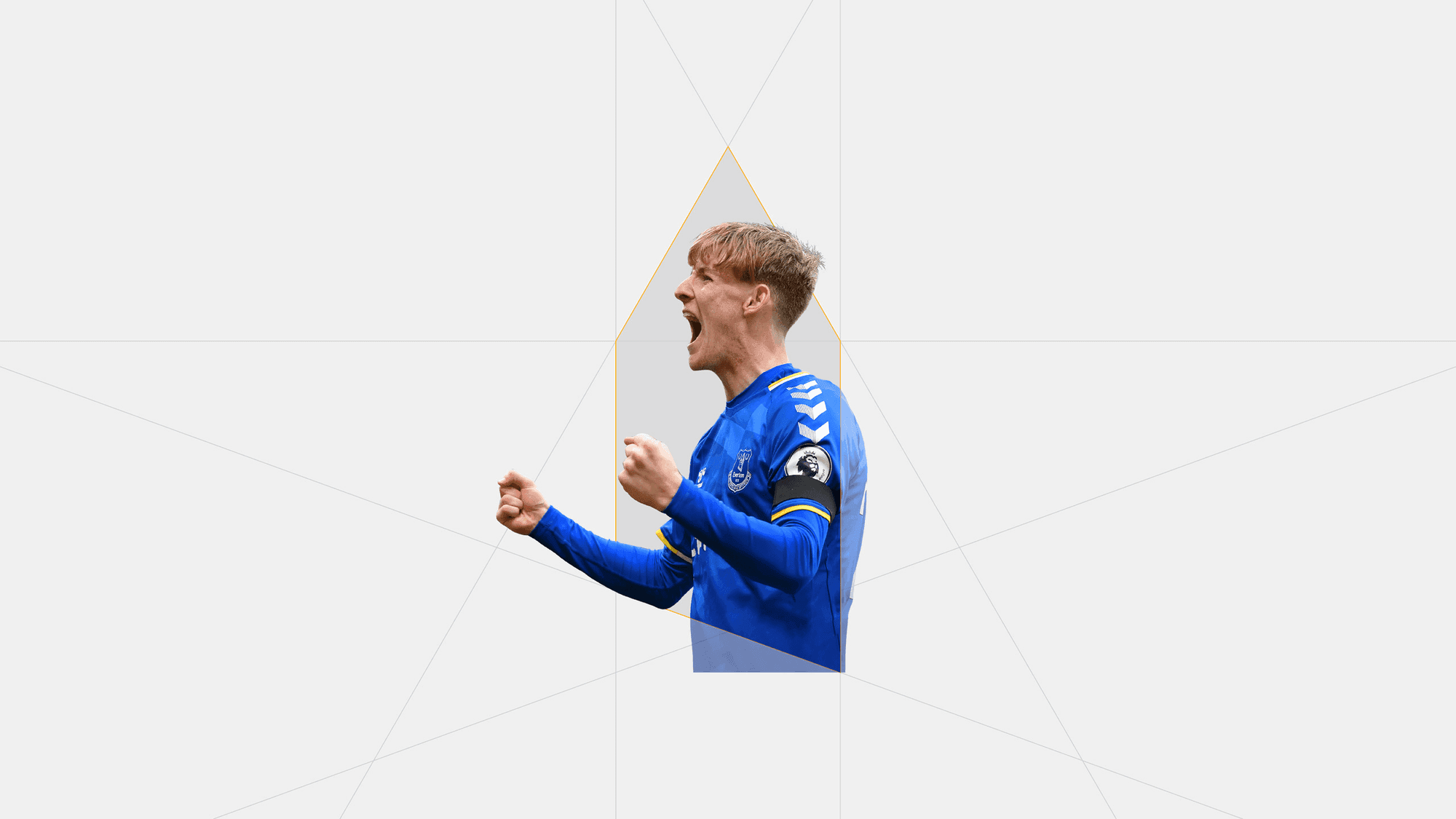
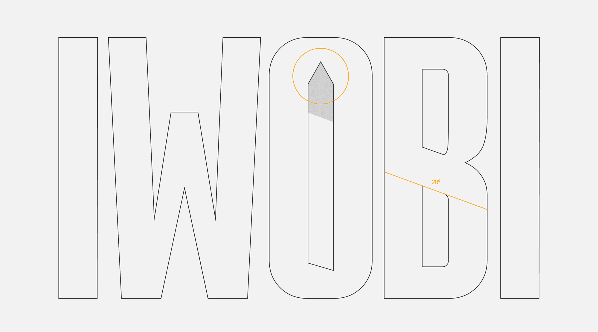
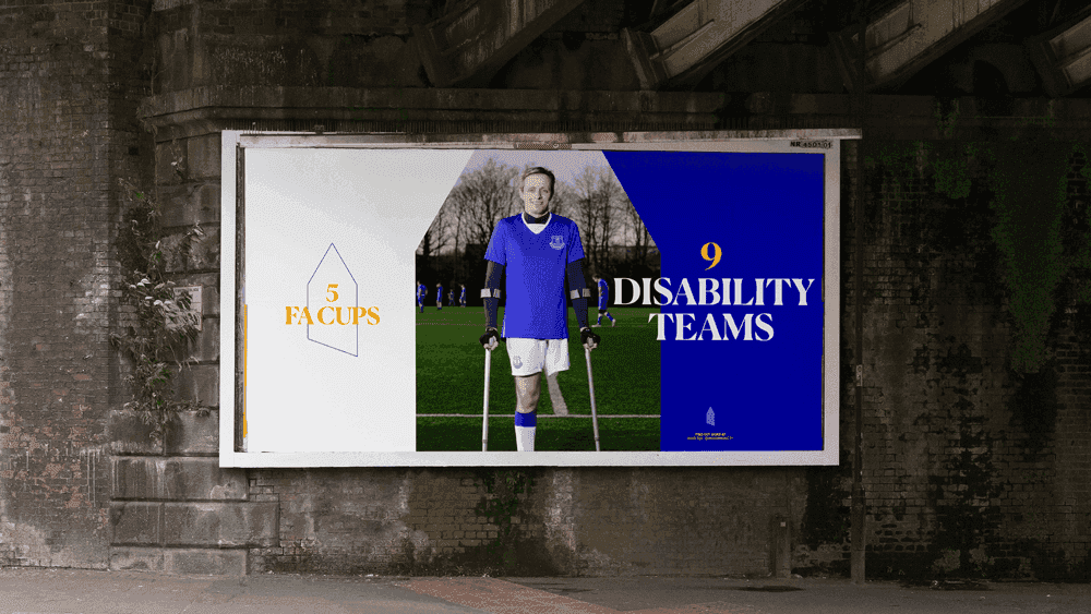
The Tower: Proudly Ours. Boldly Forward.
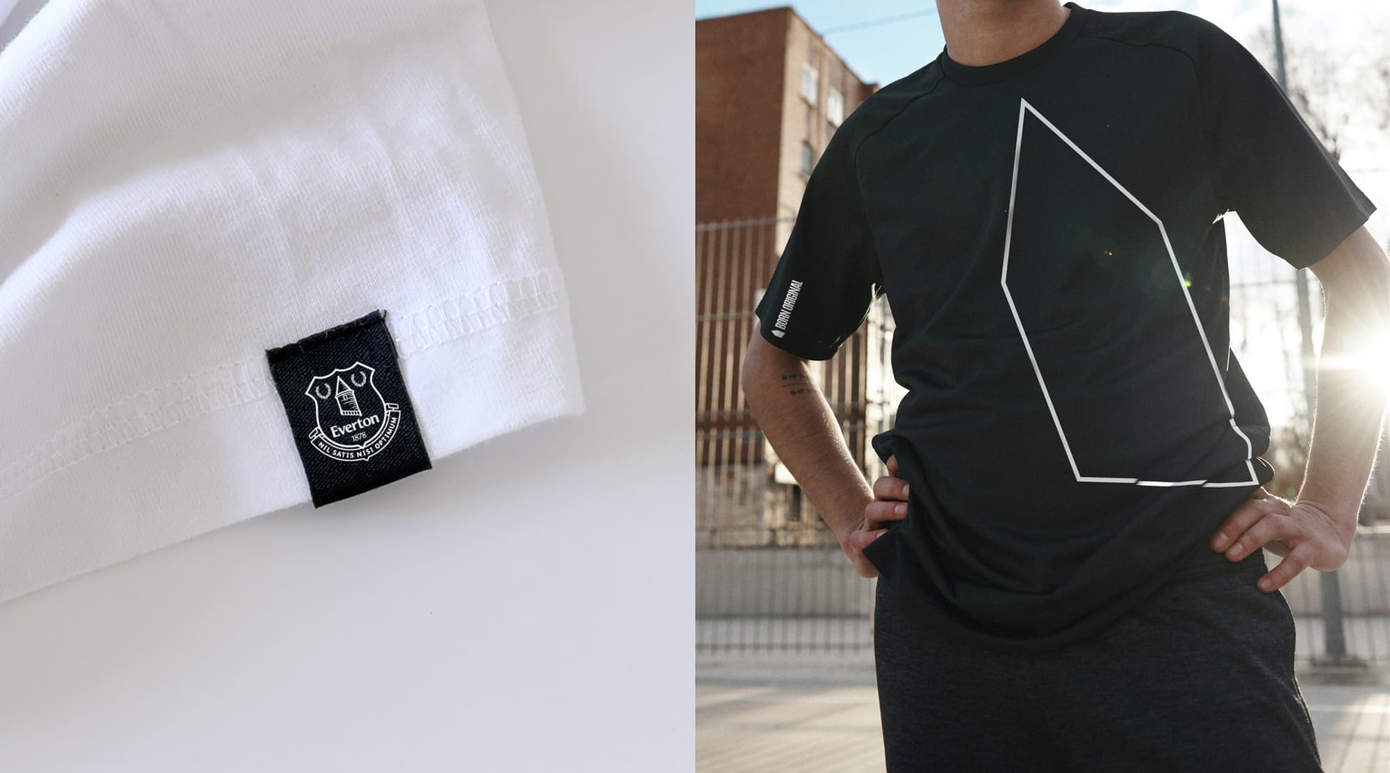
From the heart of the Everton crest, we elevated Prince Rupert’s Tower into a bold visual signature. This powerfully simple silhouette stands for everything the club represents: heritage, pride and community. Coexisting with the crest, The Tower becomes a unifying symbol that amplifies Everton’s identity on a global stage.

Symbol, Story, and Signal.
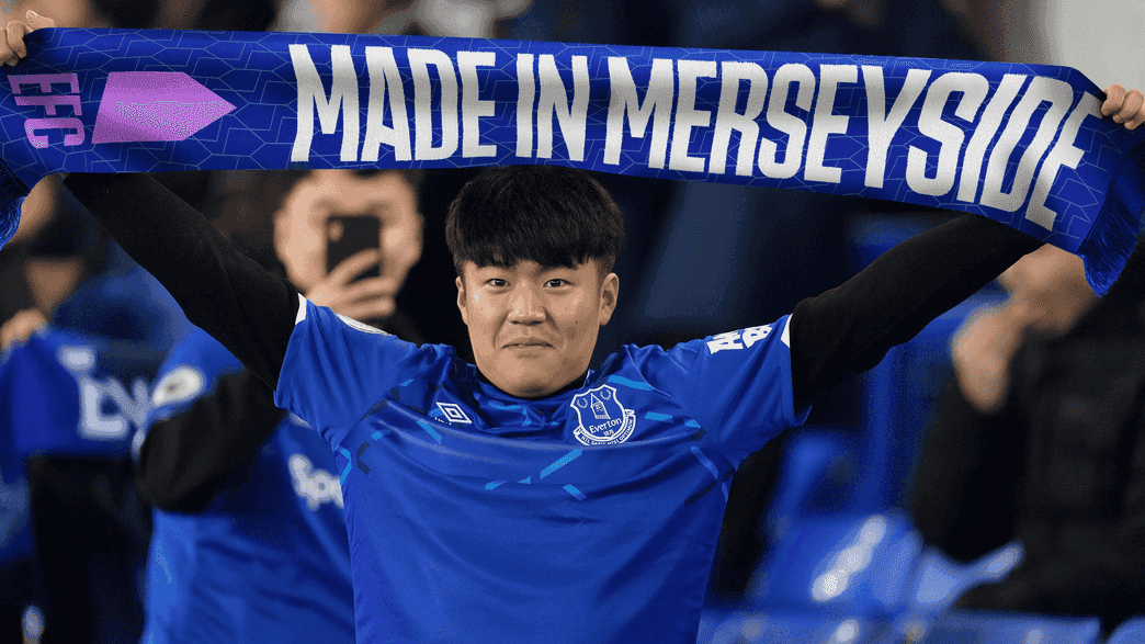
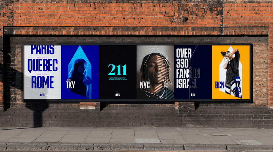
It’s a badge of honour. an iconic symbol with a sense of forward momentum that runs through the entire brand. From the crest on shirts to patterns woven into scarves, fabric, and merchandise, The Tower is more than a mark. It becomes a unifying beacon for the club, stitched into every moment of pride and belonging.
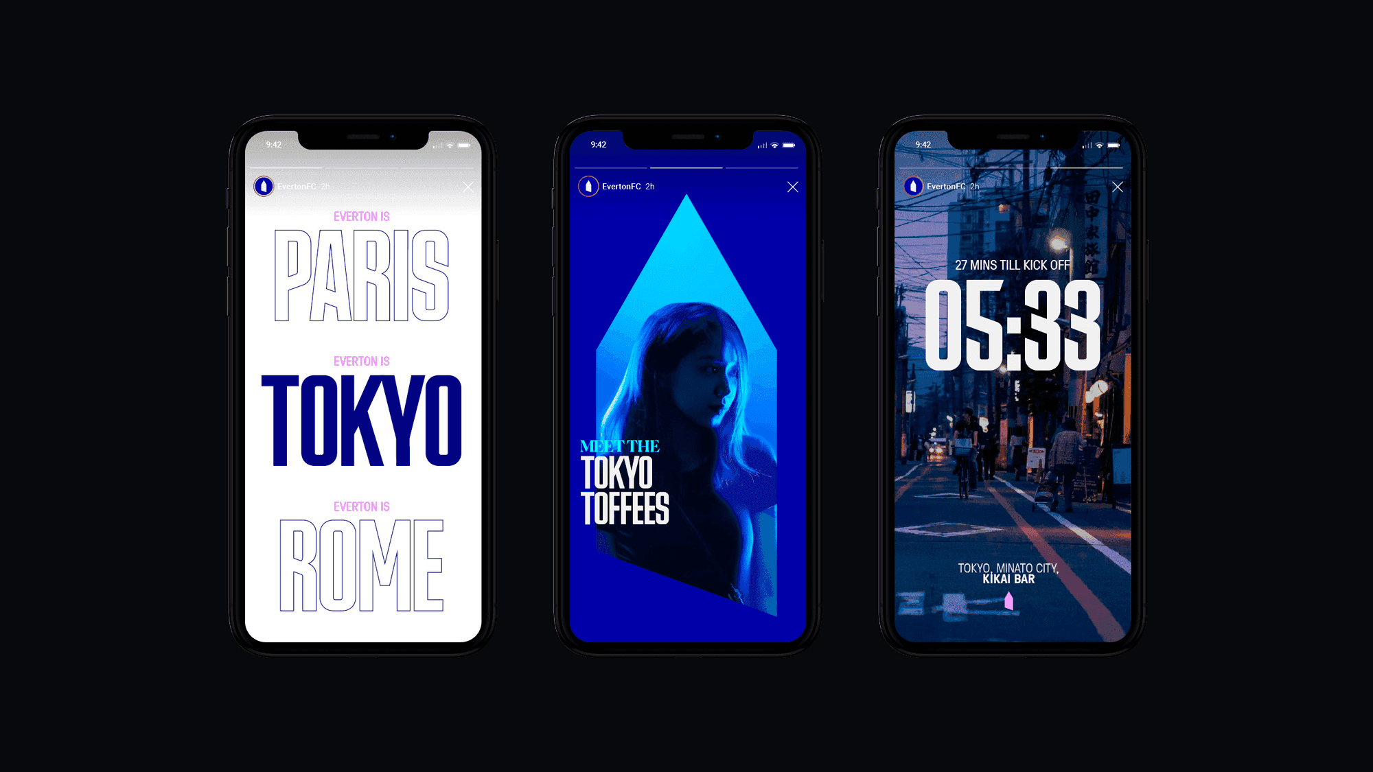

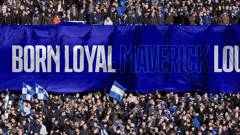
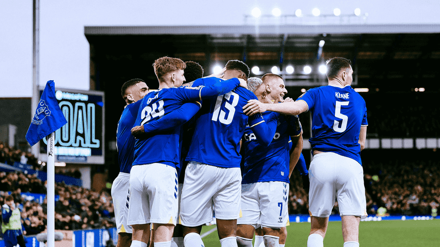
Energy That Moves With the Fans.
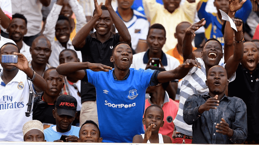
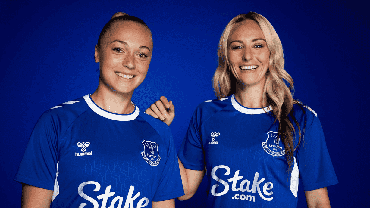
This identity strikes a rare balance. premium and aspirational, yet grounded in the values of the people. It delivers excellence without exclusion. In motion, the experience captures the pride, energy and spirit of the fans across stadium screens and digital platforms alike. It feels bold, modern and unmistakably Everton. A confident expression of a club that knows exactly who it is and who it’s for.

Words that come across loud and clear.
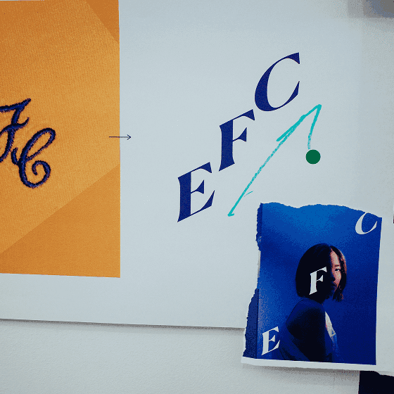
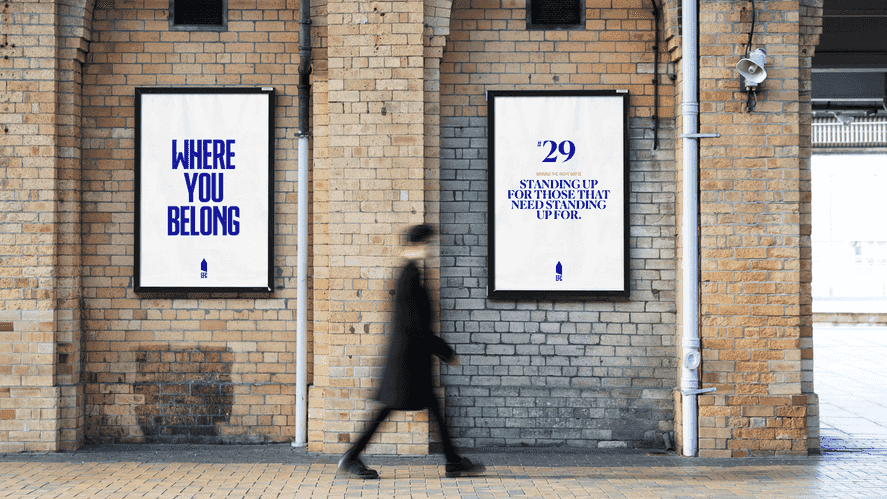
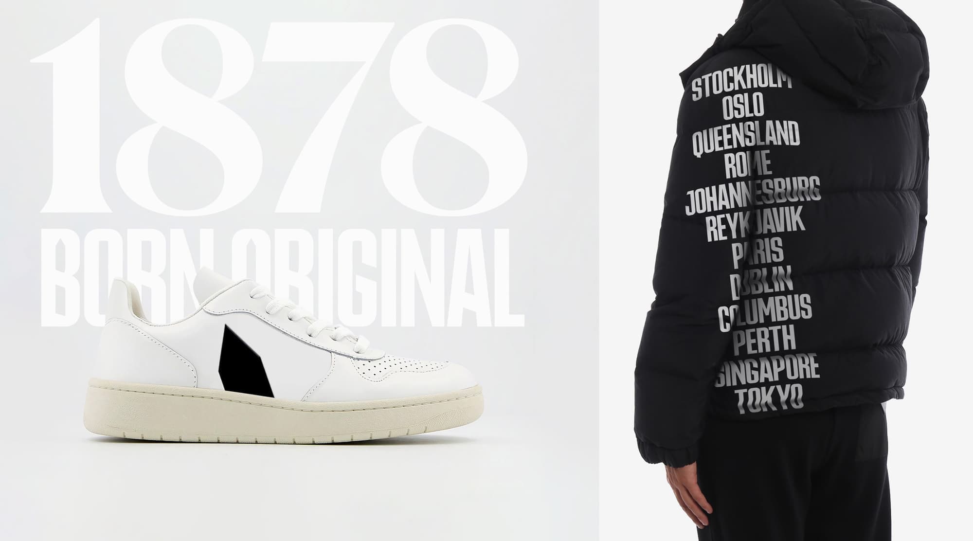
Rupert Condensed is a custom typeface inspired by the sharp angles of The Tower. Bold, striking and full of attitude, it anchors the club’s voice with confidence. Paired with Canela, the typographic system balances historic character with a fresh sense of impact, bridging legacy and progress in every headline and detail.
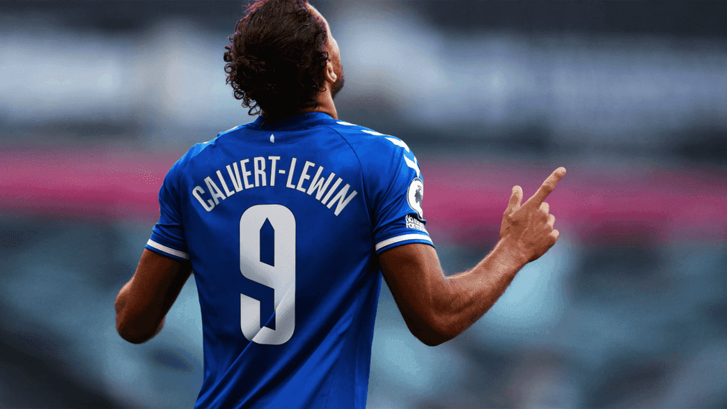
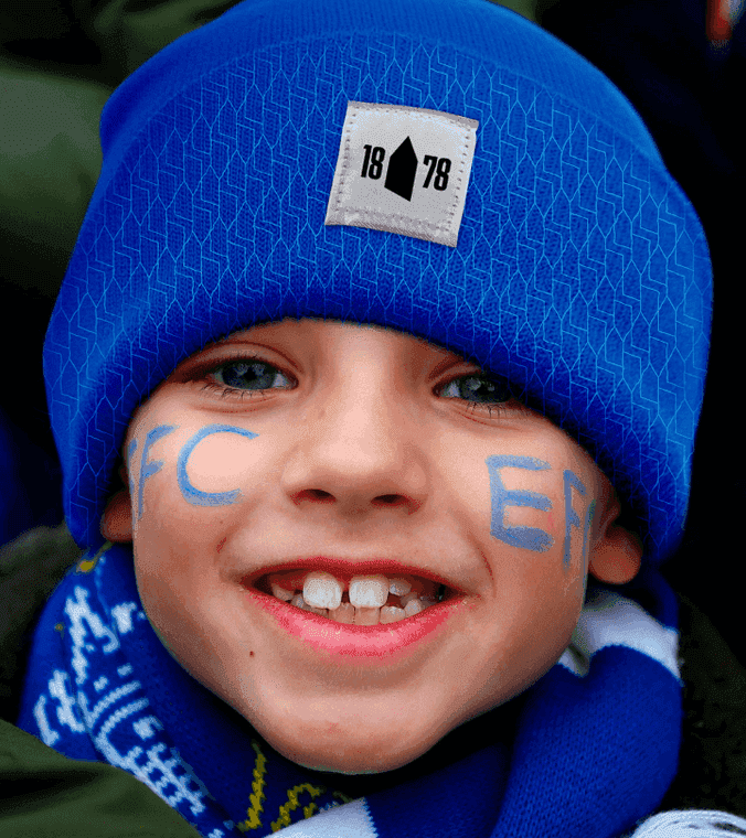
A voice for and of the fans.
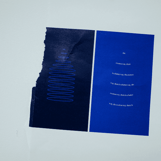
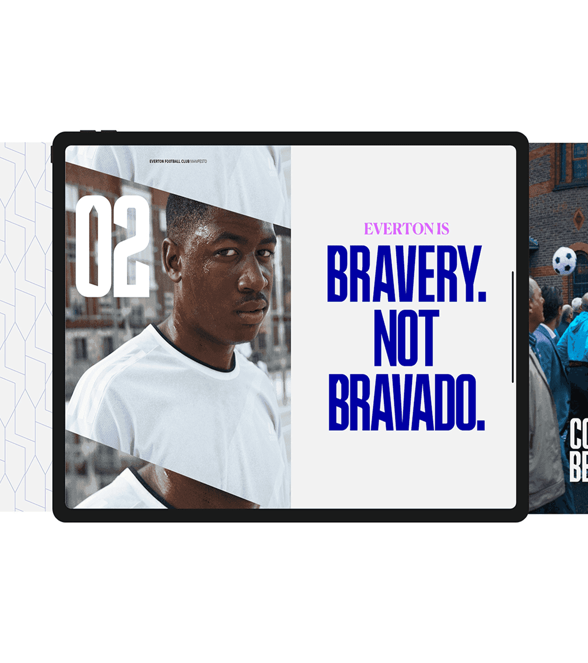
We crafted a tone of voice that reflects the honesty, wit and spirit of real football fans. delivering perspective the Everton way. It’s a written identity built for emotion and clarity, enabling the club to create and capture spirited moments across every story, platform and touchpoint.

The fabric of Everton.
Curated patterns bring a sense of crafted detail to environments and objects embedding The Tower, and everything it stands for, into the fabric of the club. From spaces to souvenirs, these elements add a layer of quiet confidence and connect fans to Everton in subtle, powerful ways.
DixonBaxi have built a brand that reflects who we are. authentic, ambitious, and committed to winning the right way, with our fans at the heart of it.
Highlights
-
£800M Bramley-Moore Dock
-
Stadium Opened 2025.