Hulu

Hulu:
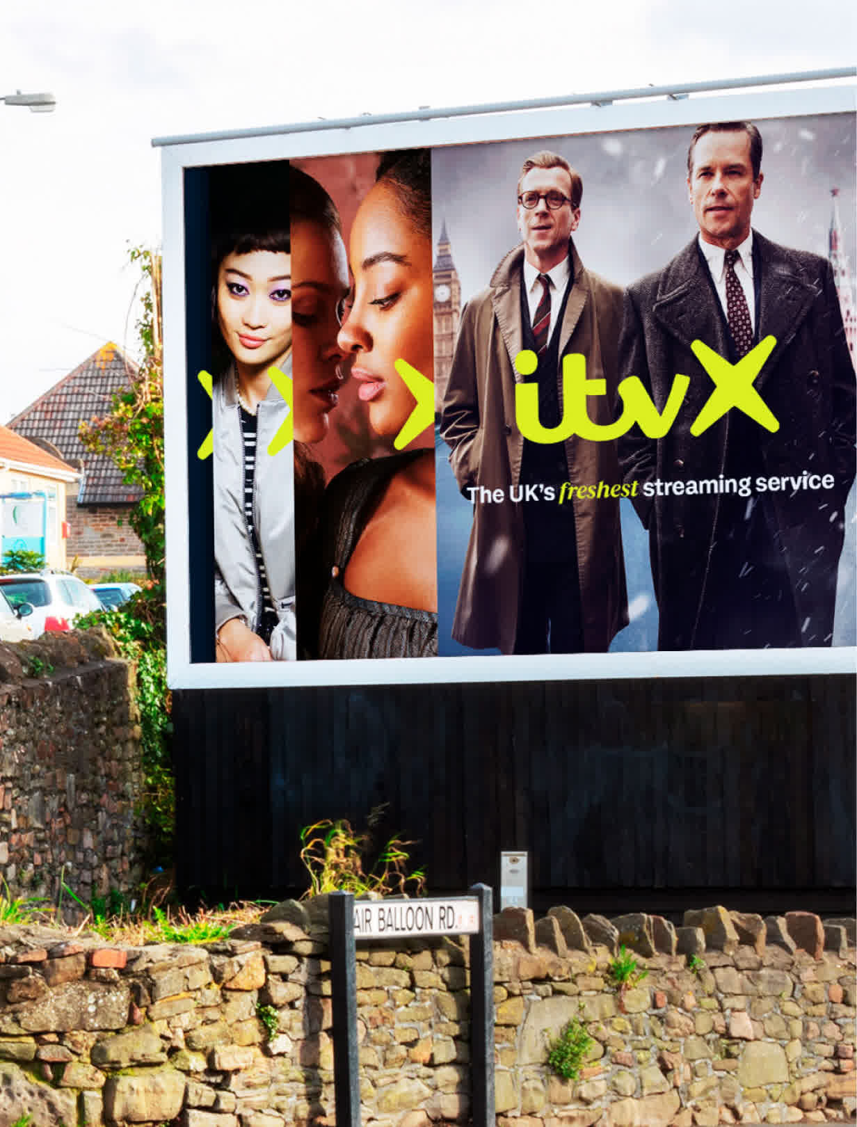
From billboard to binge.
With 39.4 million U.S. subscribers, Hulu is a major force in streaming. home to genre-defining Originals like The Handmaid’s Tale, live TV with sports and news, and a deep, diverse library. As Hulu grew, so did the need for clarity and cohesion. we helped realign the brand, marketing, and product into a single, seamless ecosystem; One Hulu.


Back Where It All Began.
The Hulu logo has always carried strong equity, but it needed deeper meaning. Research led us to the origins of the name. an ancient Chinese proverb where Hulu refers to a gourd, the holder of precious things. That insight became the foundation for the new brand.

The Vessel: A dynamic blend of storytelling and premium expression.
The ‘U’ in the logo now forms part of the Vessel. an idea that flexes from charismatic storyteller to elevated, premium expression. It’s a symbol that unites brand and product, holding everything Hulu offers in one seamless, connected identity.


From launch to stream. It’s one Hulu.
The Vessel seamlessly connects brand and product, enhancing the digital experience with clarity, consistency, and 100% attribution. Every element is designed to bring ease, delight, and curated discovery, making Hulu feel more intuitive, immersive, and unmistakably itself.


Connecting people to the stories they love.
The Vessel is an infinitely adaptive design and narrative system. It sparks conversations and serves as a guide. It’s a friend and a fan which connects us to the stories we love. Celebrating powerful characters, iconic moments and having something to say about all of it.


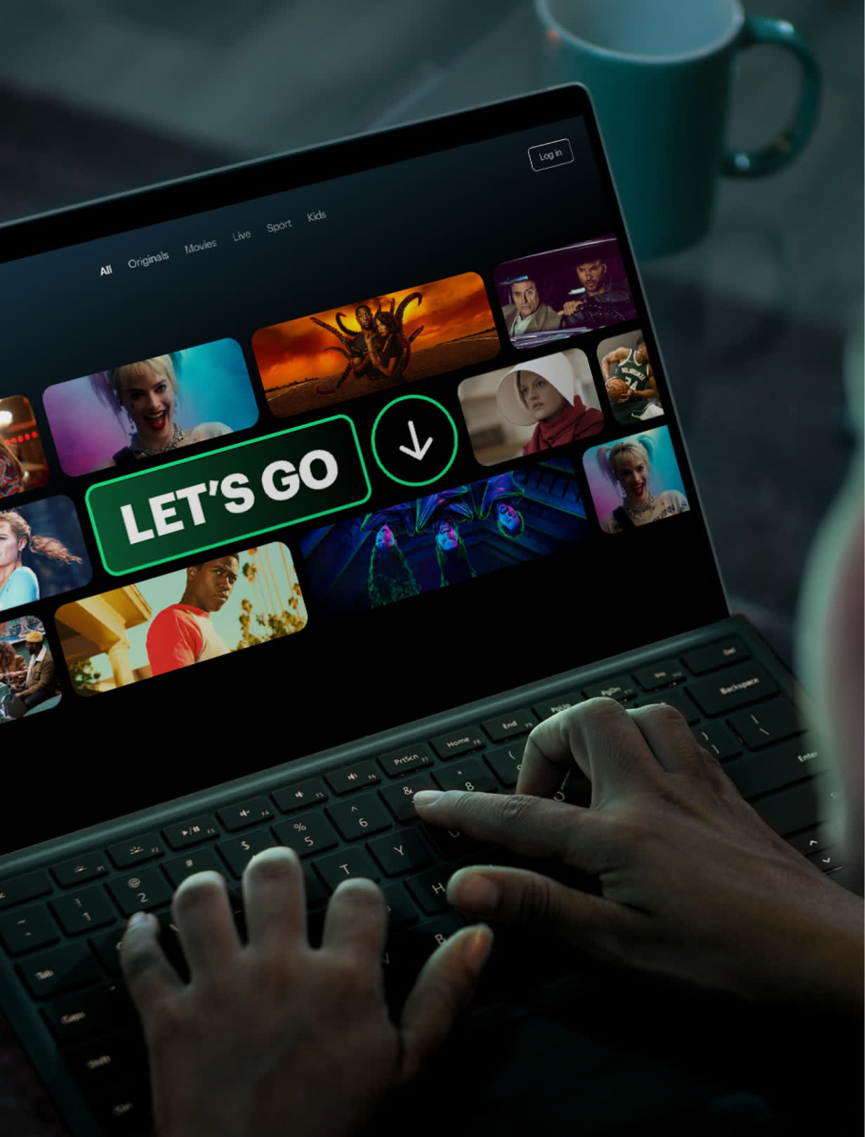
Maximum attitude. Waffle free.
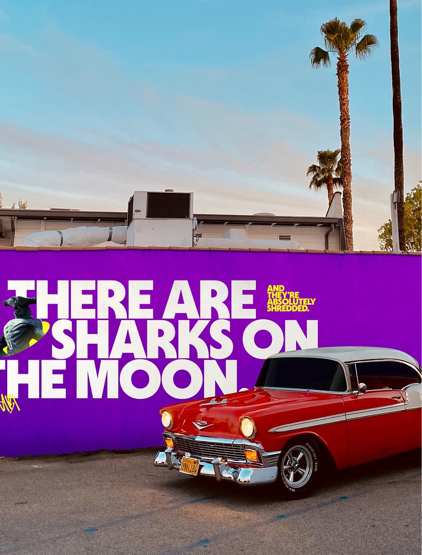
The new voice features punchy headlines that make people think twice, as much being friendly and fun, telling people whaT they need to know. It’s dialled up in out-of-home advertising that is optimistic, charming, cheeky, and dialled down on the product, making every word count in this waffle-free zone.


Bolder. Brighter. Greener.
We doubled down on Hulu green. owning it, using it to punctuate stories and anchor the brand. WE Then expanded the palette with richer, content-inspired tones that build a deep, atmospheric world, bringing the warm glow of the TV experience into every touchpoint. The design system is adaptive and plug-and-play, crafted to work everywhere and for everyone.


It was a true cross-functional team collaboration. It was about doing it different and challenging the norms and creating a design system that was truly powerful.
Highlights
-
+88% subscribers since rebrand (2019–2025).
-
Hulu revenue nearly tripled since 2019.
-
Rebrand moderniSed identity, widened appeal instantly.
-
60% rise in engagement post-brand relaunch.