Reimagining a cultural landmark for a daring future.
Inspired by the past, designed for the future the Printworks building in Canada Water has been an integral part of London’s cultural landscape, from printing the Daily Mail and Evening Standard from 1989 until 2013, to cultural venue Printworks London opening its doors in 2017. Now it’s evolving again. Continuing our partnership with British Land, we created a brand born of the building’s heritage and built for the future, preserving the legacy of The Grand Press by embedding it in its identity.
An identity inspired by the past, designed for the future.
Inspired by the past, designed for the future the Printworks building in Canada Water has been an integral part of London’s cultural landscape, from printing the Daily Mail and Evening Standard from 1989 until 2013, to cultural venue Printworks London opening its doors in 2017. Now it’s evolving again. Continuing our partnership with British Land, we created a brand born of the building’s heritage and built for the future, preserving the legacy of The Grand Press by embedding it in its identity.
“Broadwick Live announced a provisional deal with British Land for a revamped Printworks to reopen on the redeveloped site in 2026. Simeon Aldred, co-owner and head of strategy at Broadwick Live, says...”
Co-owner and Head of Strategy at Broadwick Live.
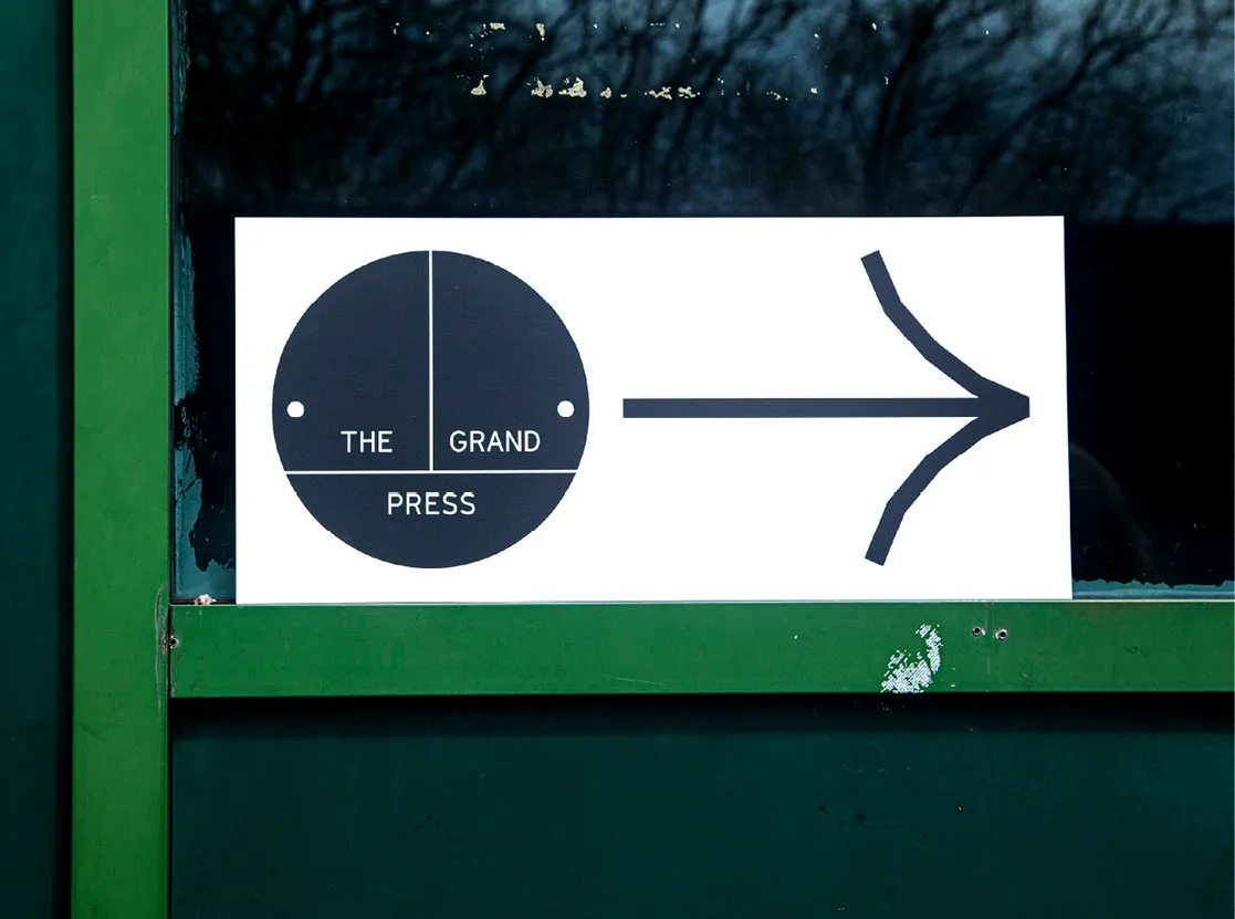
A tone of voice harnessing the power of three.
The Grand Press brand is tied closely to the rhythm of the number three. The logo and graphic device are visually split into three sections and inspirational copy often comes in the form of three-word statements. The power of three is a visual and verbal device both succinct and impactful. At its most symbolic, it creates visual ties to the three pillars of The Grand Press: people, businesses and ideas. At its most functional, the three-beat approach creates headline statements that range in tone from poetic to commanding.
A typeface with mechanical precision. A palette found within the space.
GT Cinetype is bold, graphic and utilitarian, reminiscent of the found signage and angles of the building’s facade. At larger scales, the type’s faceted details create visual drama, while smaller scales help tell The Grand Press’ story with clarity. The colour palette comes directly from the space, inspired by the iron, concrete and stone throughout the original structure; Grand Green pays homage to the original cladding, while the complimentary Press Orange signifies the refurbishment.
Creating a visual language - both industrial and human.
A suite of image treatments pay homage to both the building’s printing and musical histories. The treatments are born from raw visual references, from distressed concrete floors to ink splatters and long-forgotten stickers. Halftone, a traditional printing technique, features heavily as a nod to the former printing press.
Sharing the story and experience of The Grand Press.
The brand guidelines are printed and bound as a book. The volume doubles as the story of the building and brand as well as technical guidelines, presenting past, present and future at the same time. We had the opportunity to help British Land bring The Grand Press to life in the Press Hall too. At the event, we revealed a brand film in partnership with Greenaway & Greenaway. The film is emotive, poetic and non-linear with an original soundtrack, made specifically for the 12x4 ft main screen in the Press Hall.