21Shares
21Shares:
Building the bridge to crypto’s future.
At a pivotal moment in finance, investors are caught between the confidence of traditional markets and the promise of crypto, often obscured by complexity. What’s missing is a clear bridge between the two. For 21shares, we built a brand that does exactly that. One that brings clarity, trust, and confidence to crypto investing, translating complex technology into accessible, credible products. The result is a brand designed to guide people forward, making the future of investing feel understandable, secure, and ready to step into.


A Clear Path Into the Future of Finance.
Our strategy positions 21shares as a trusted partner in a volatile market. A brand that cuts through noise, removes friction, and supports investors at every stage of their journey. Acting as a bridge between traditional finance and crypto native culture, 21shares speaks to both with clarity, confidence, and a distinctly honest, proudly knowledgeable voice.


The bridge: from product to people.
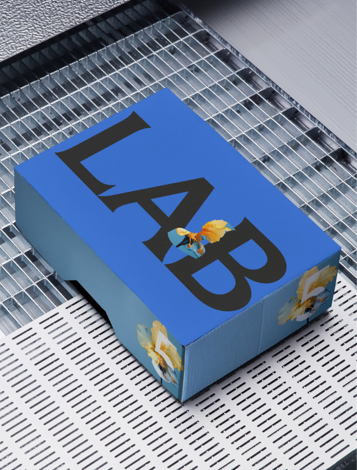
The identity is built on one clear idea: The Bridge. It connects traditional finance with the future of digital assets, shifting from technical complexity to human clarity. The bridge shapes the logo and visual system, linking elements together to create a confident, connected structure that makes a complex world feel understandable, trustworthy, and ready to move forward.


Precision meets personality.
Crypto is full of complexity. The 21shares identity cuts through with simplicity and clarity. Arresting messaging paired with elegant typography. Complex data distilled into simple charts. A bold editorial voice matched with crafted refinement. High contrast became more than a design choice, it defined the rhythm of the brand.

Statement driven to stand out.
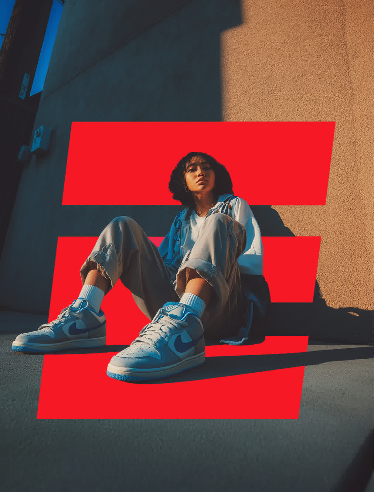
Our art direction captures crypto in its human context, real people, real journeys, real moments of discovery. Expressive flash photography brings immediacy and edge, while still grounding the brand in warm, everyday lifestyle moments. It follows the progression from crypto native to investor with authenticity and energy.


Intentionally imperfect.
To bring warmth into a high-contrast world, we introduced a suite of expressive, tactile illustrations. Intentionally imperfect, their cut-out aesthetic adds depth and playfulness, softening the system’s technical precision. Used sparingly, they act as visual punctuation. Small, human moments that bring personality and warmth to a clear, confident brand.

One color, infinite warmth.
Within a largely monochrome world, Coral becomes the brand’s emotional signature. It cuts through black and white with warmth and intent, softening the system’s sharp edges. Distinctive and human, Coral signals approachability and trust in a category that too often feels cold, distant, and mechanical.


Built with intention, crafted with conviction.
Working closely with the 21shares team, we built a brand ready for what comes next. One with character, clarity, and a confident point of view. This is not crypto for insiders. This is crypto made clear. Trusted, accessible, and designed to bridge where you are today with where you’re heading next.


Our rebrand is a confident declaration of our mission. We are the intentional bridge that transforms the complexity of digital assets into the clarity and confidence investors need for their financial future. This new identity firmly establishes us as the trusted, human face of crypto investment.